Introduction
Rhino Federated Computing enables secure data analysis across healthcare, life sciences, and finance through privacy-preserving AI and federated computing. Their platform allows organizations to collaborate with sensitive data, without ever moving it, pushing the boundaries of what’s possible in AI-driven research and discovery.

The Challenge
Rhino had a bold vision and breakthrough tech but explaining federated computing in a clear, compelling way had proven difficult. Past attempts lacked clarity, visual impact, and cross-industry appeal. They needed a brand and website that could simplify the complex and connect with both scientific and financial audiences.
The SOLUTION
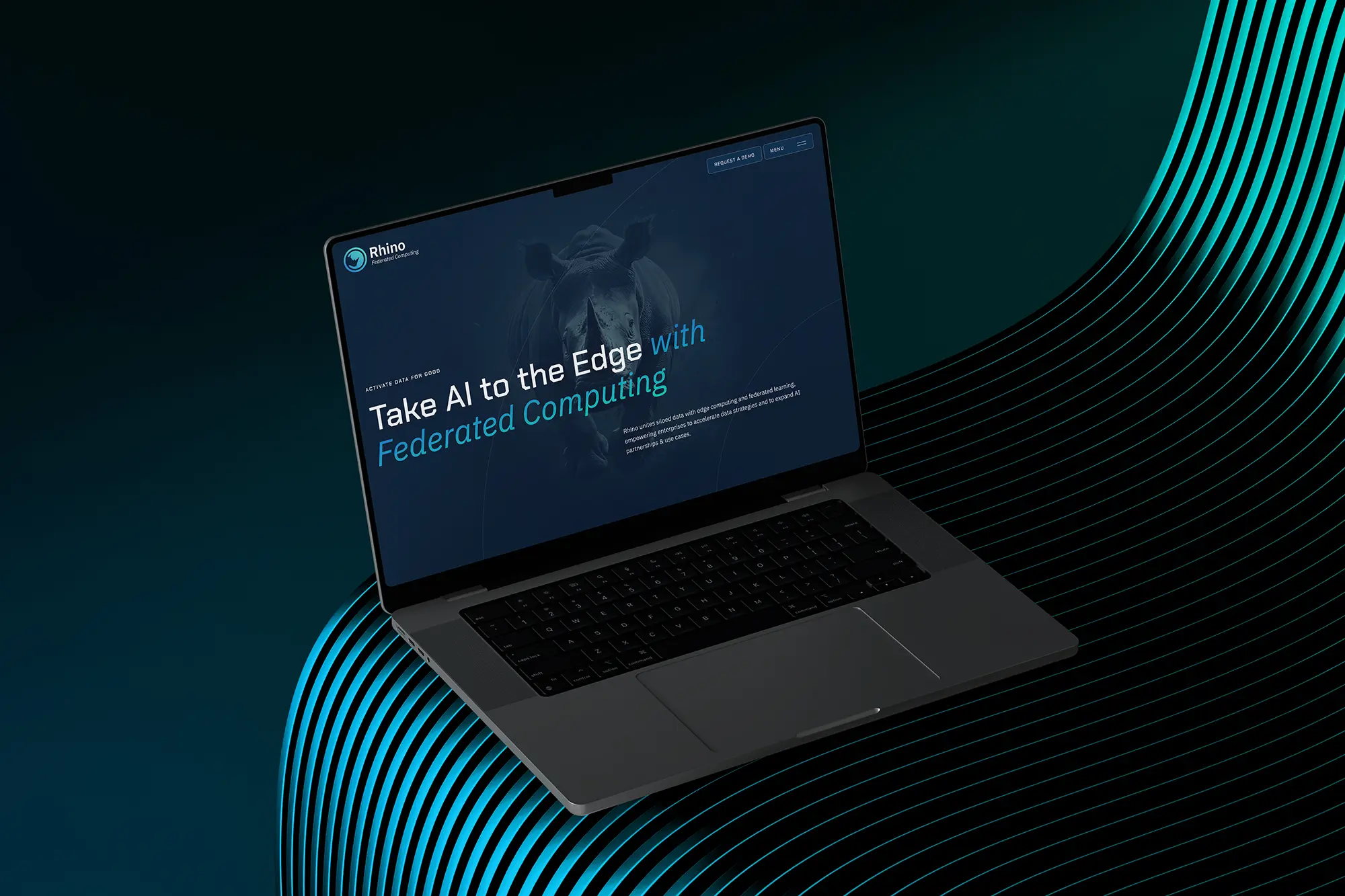
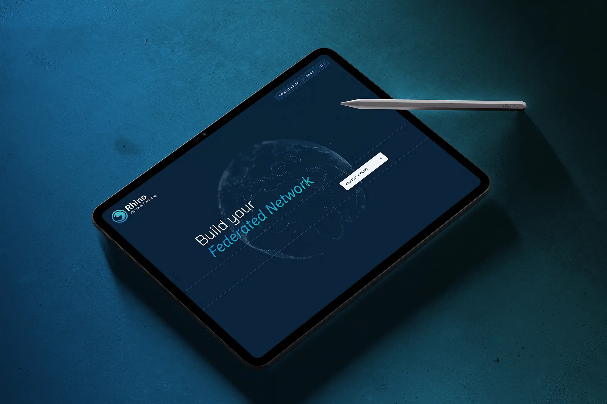
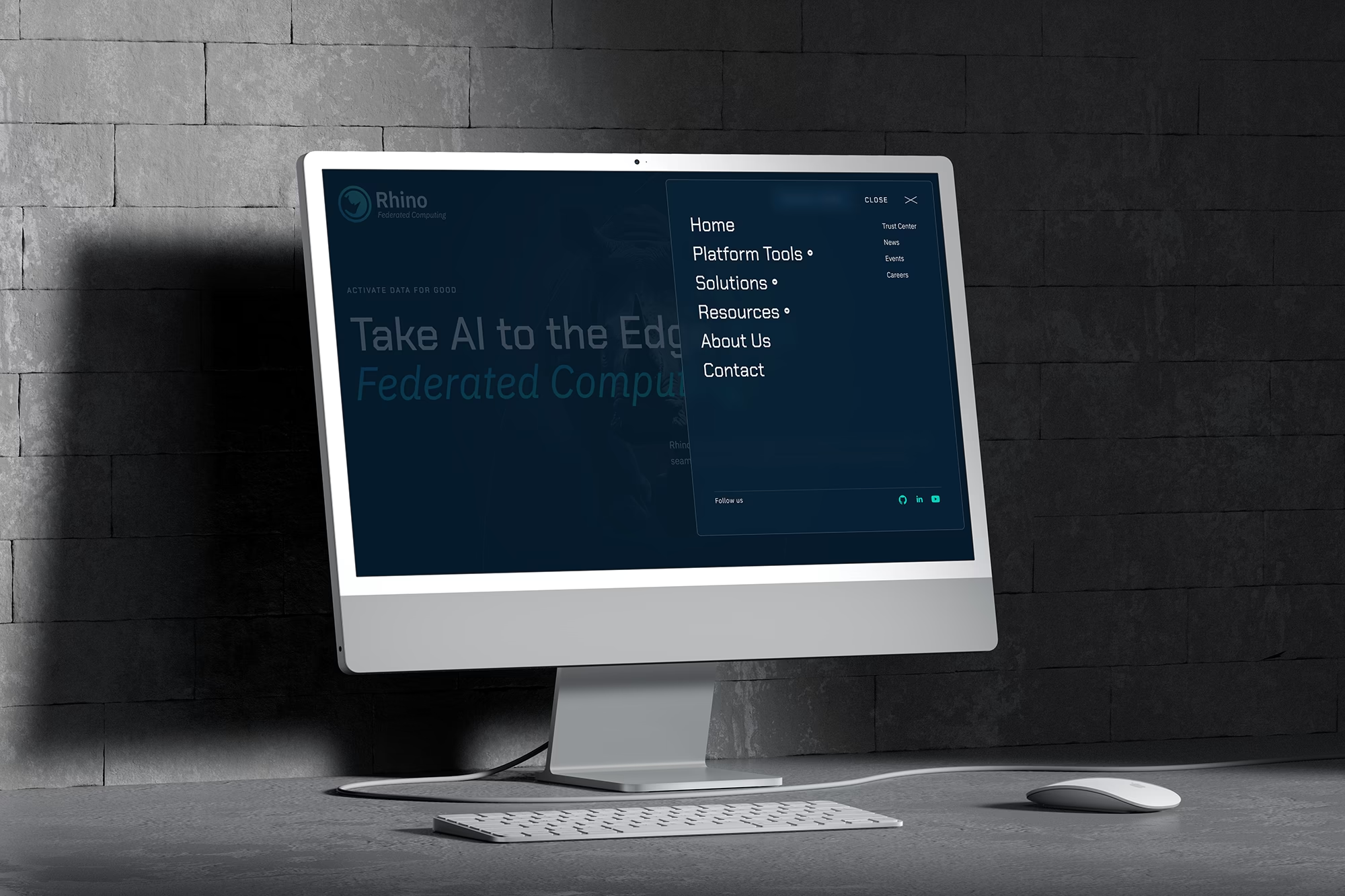
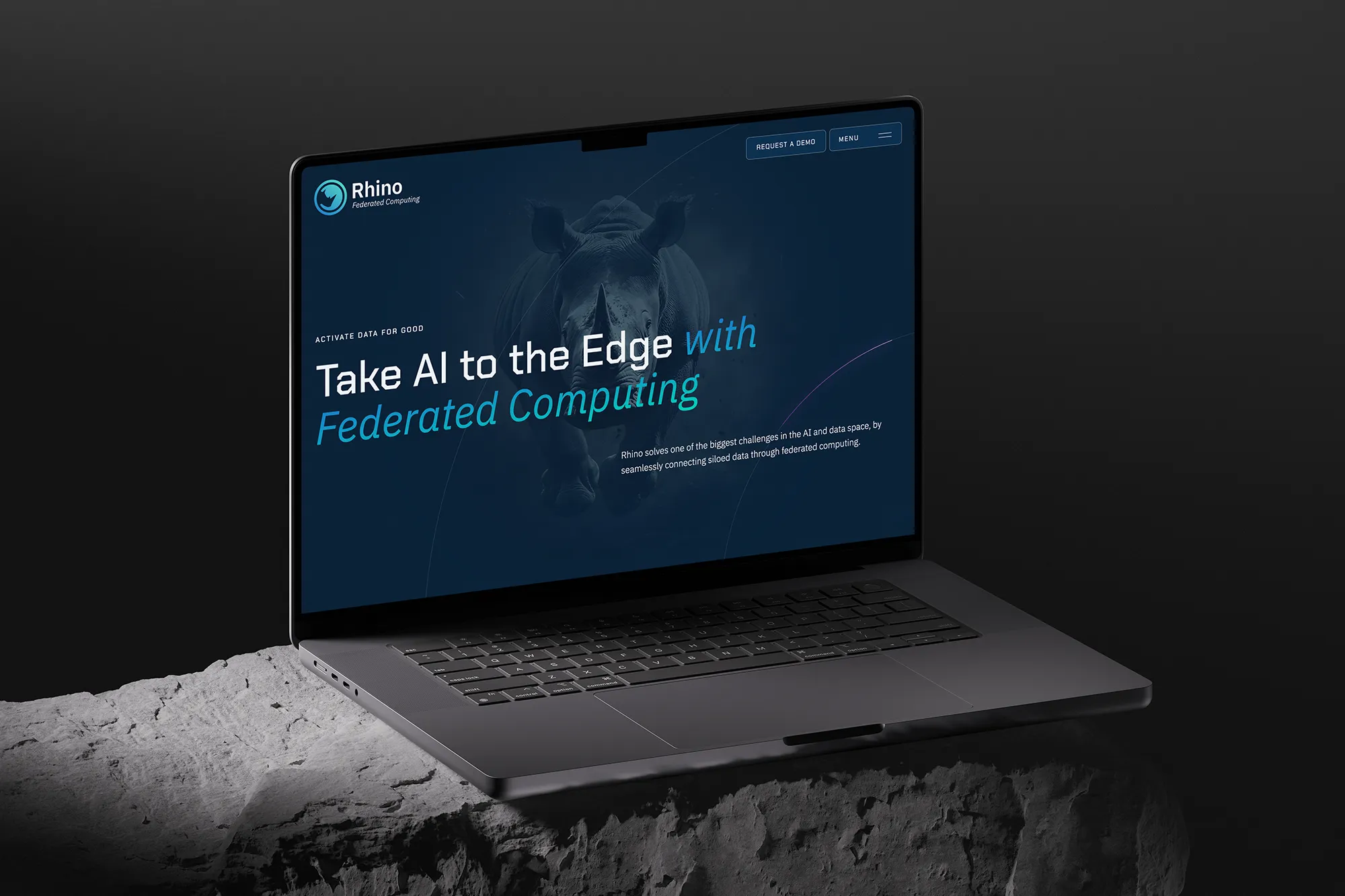
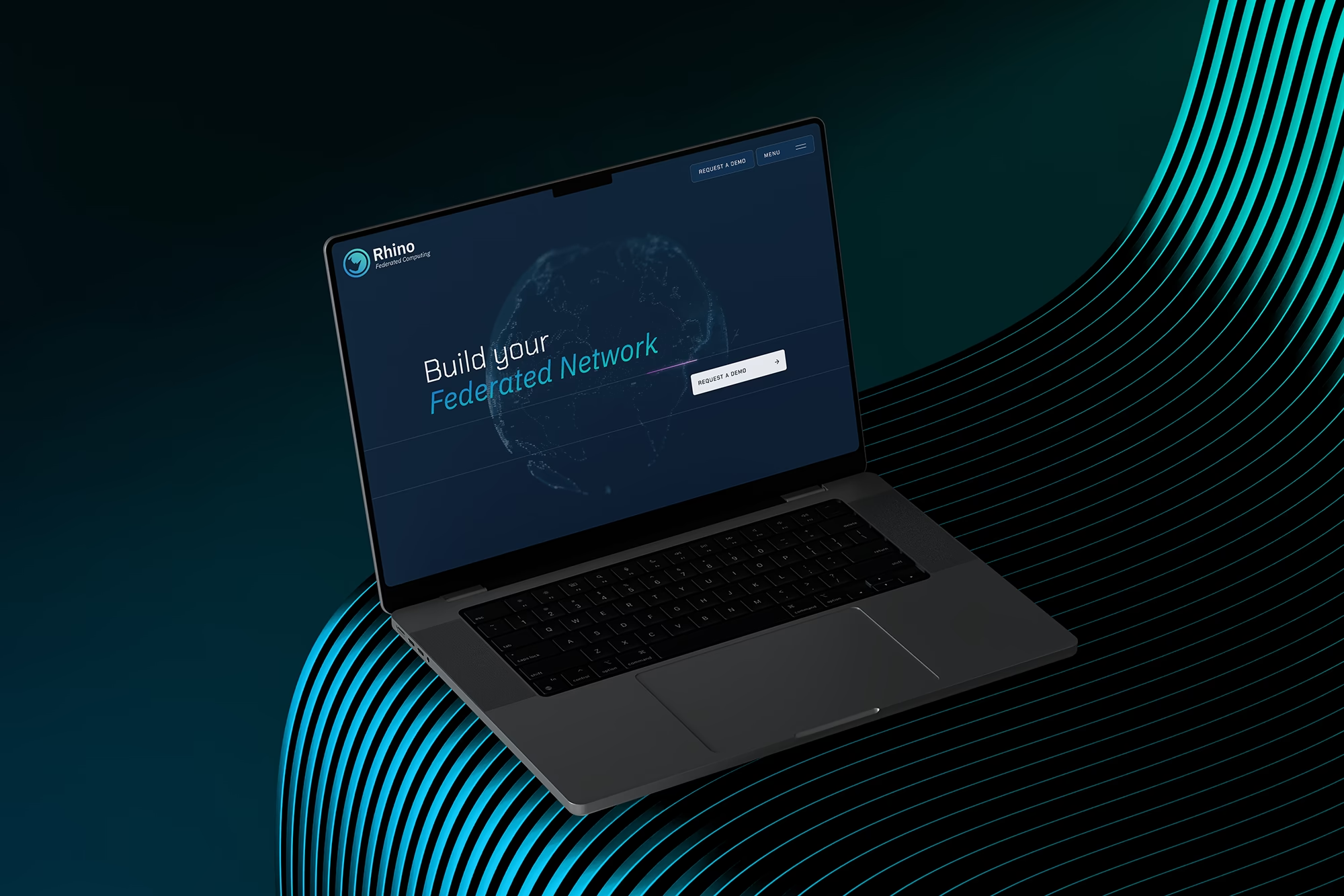
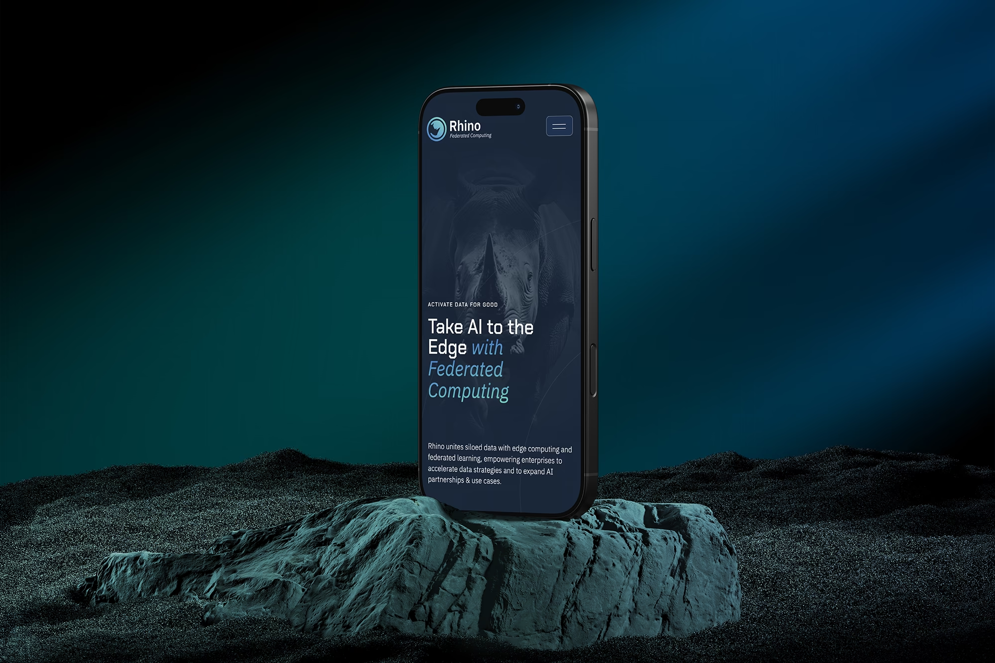
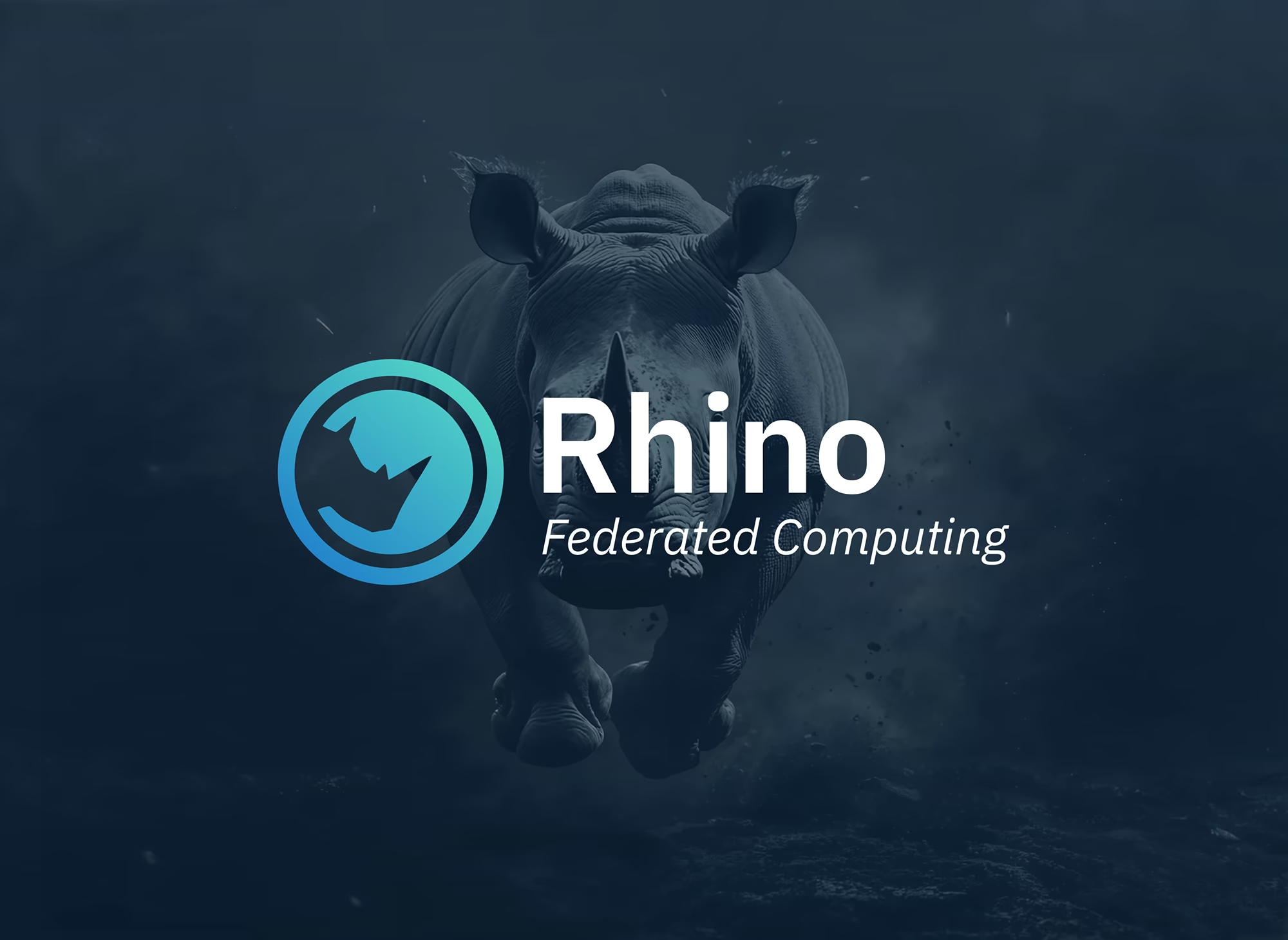
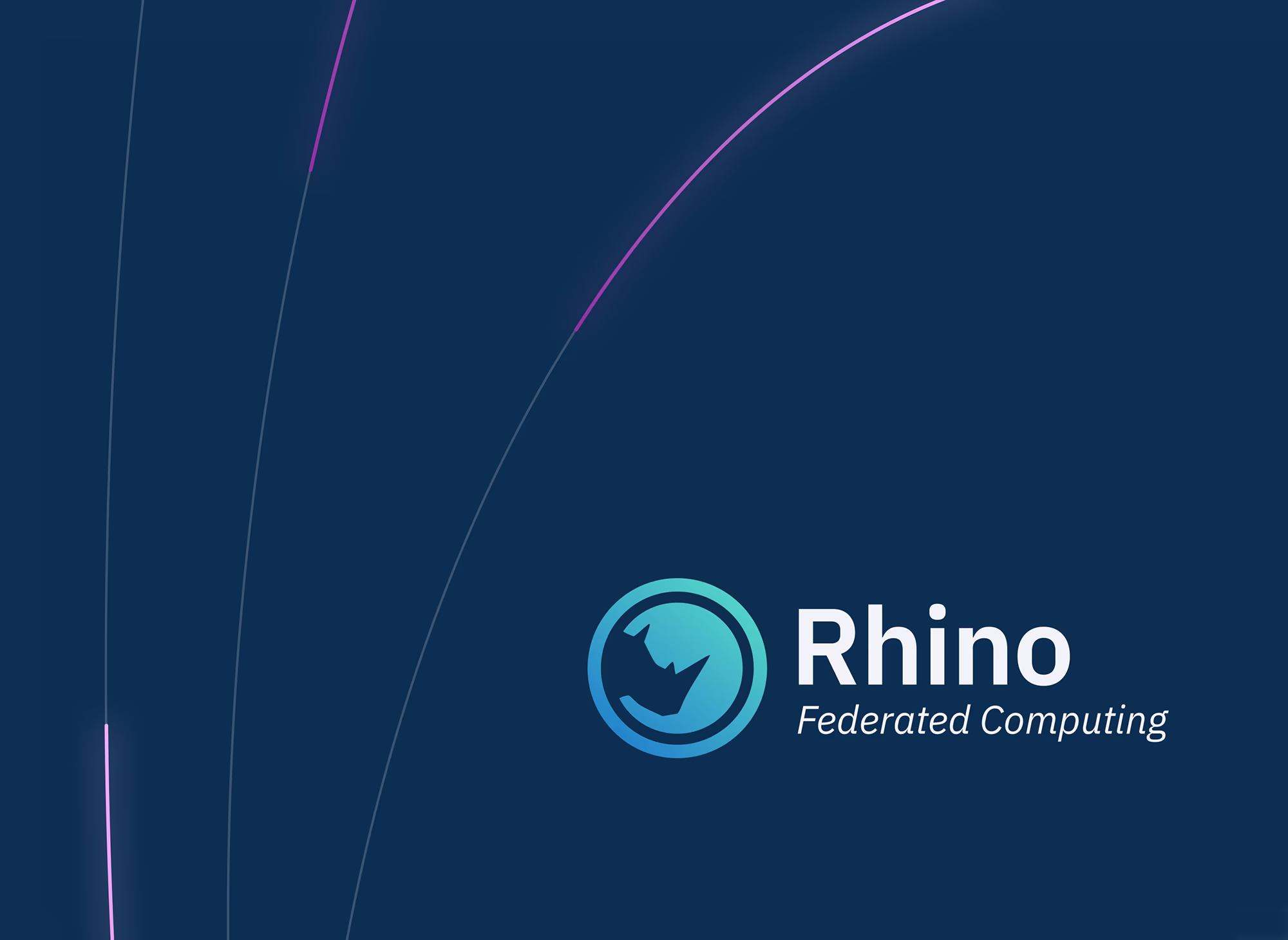
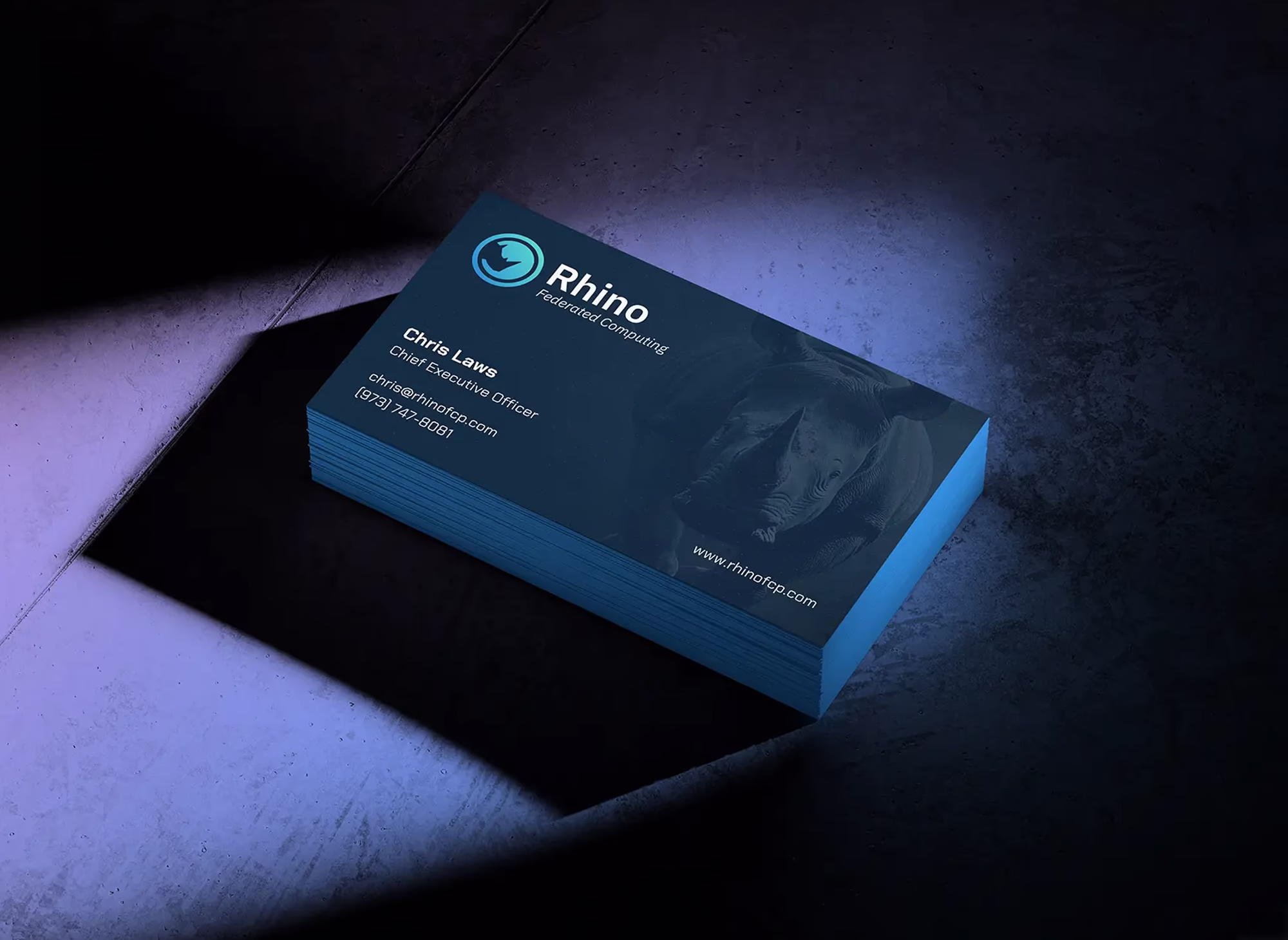
We anchored the brand around their namesake—the rhino—a symbol of power, precision, and momentum to unify their messaging while conveying the strength of their platform. A sleek, dark design, custom animated linework to represent secure data flow, and a modular layout allowed Rhino to present their story with clarity and control.
BRAND IDENTITY
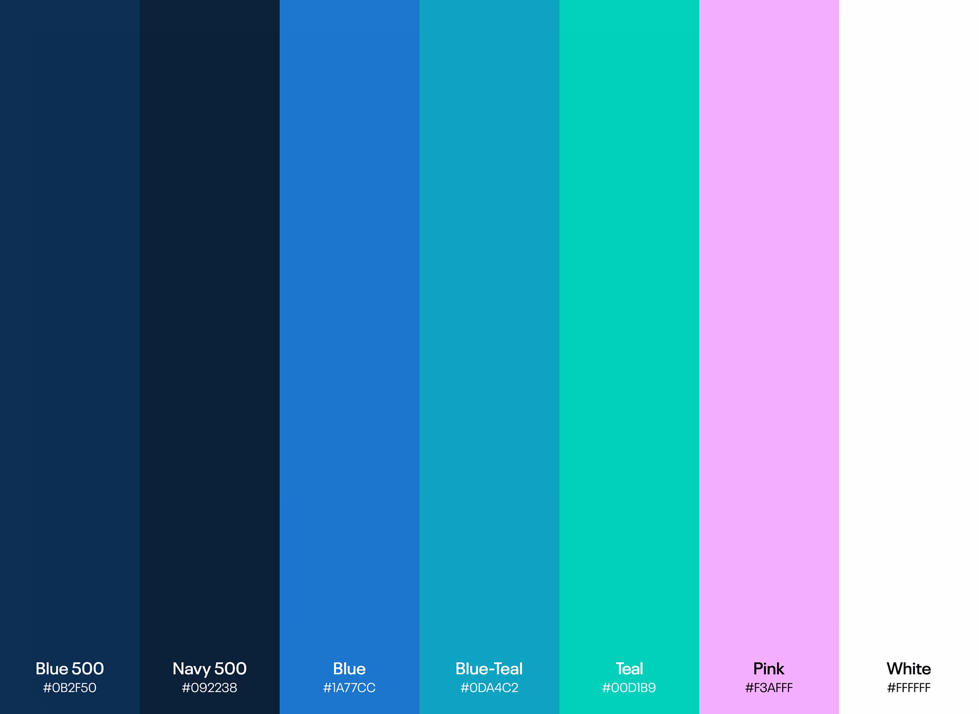
Rhino’s updated identity balances scientific credibility with technical sophistication and allows them to speak to multiple industries without diluting their voice. The rhino motif, clean typography, and bold color contrasts create a distinctive look that reflects both their strength and agility in the market.

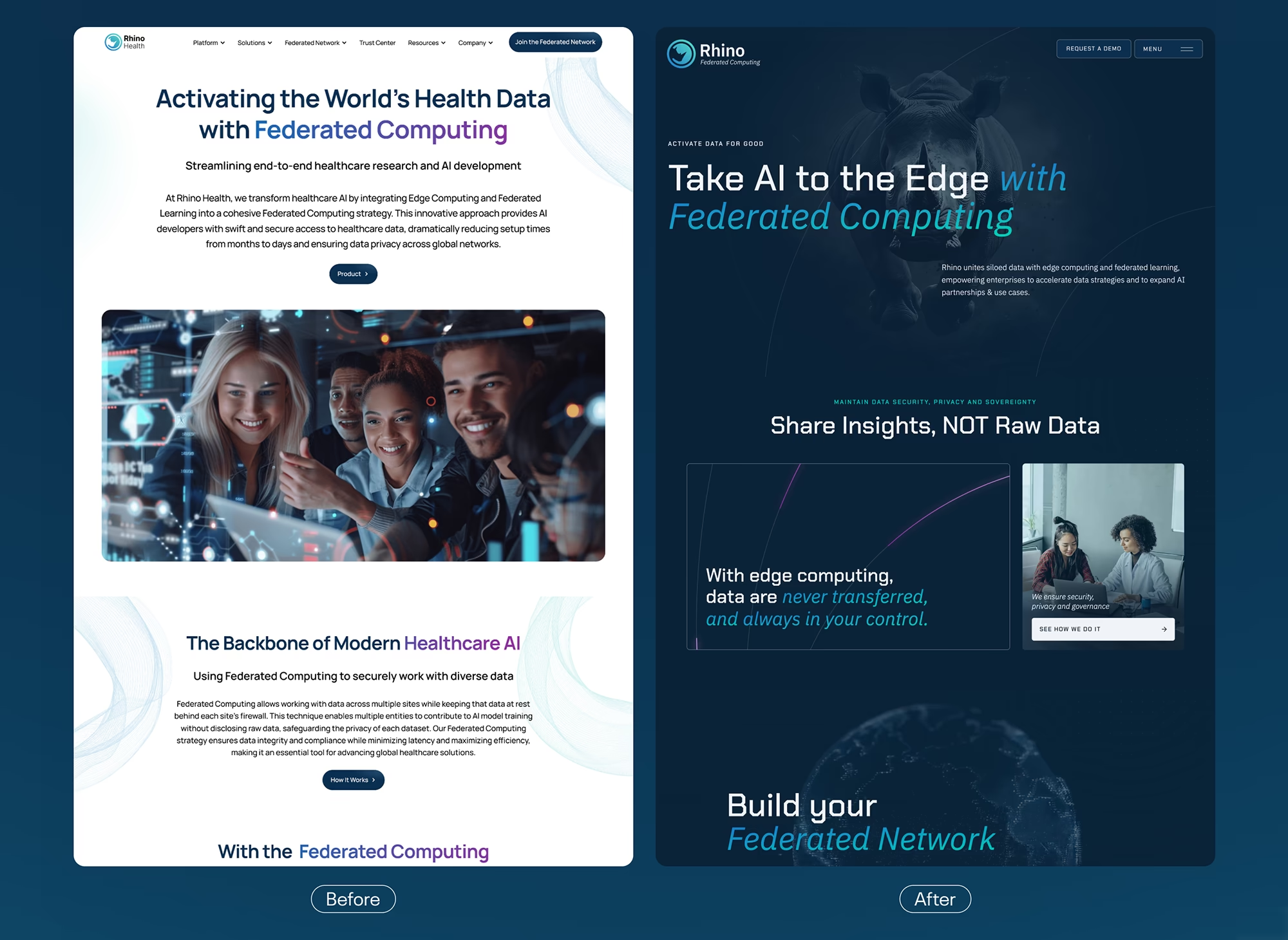
Before / After
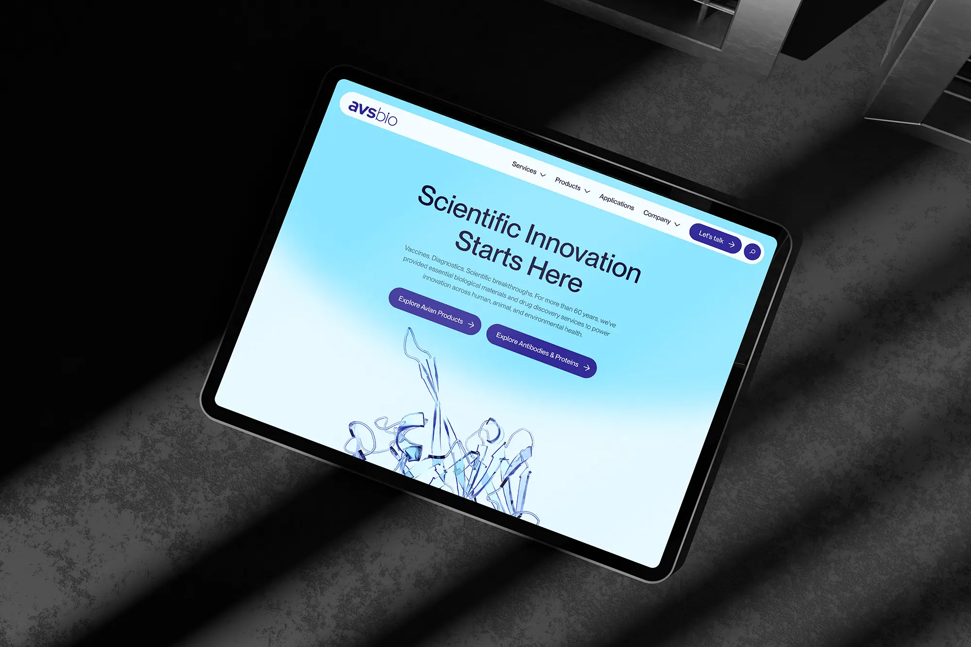
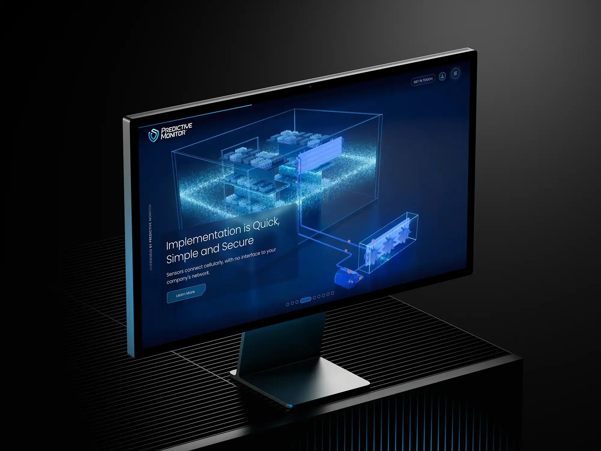
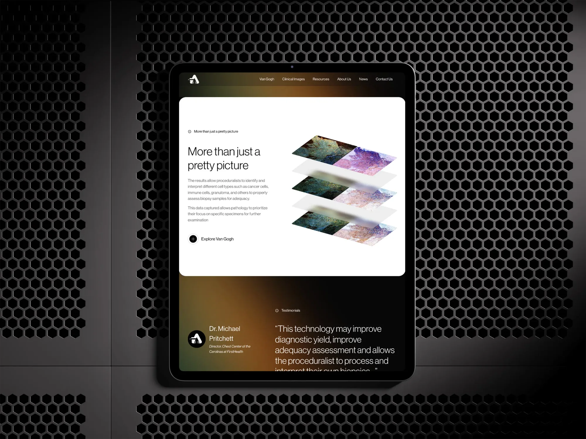
We translated Rhino’s abstract offering into a user-friendly site that guides visitors through their value proposition with ease. Animated linework visualizes data flow, while intuitive navigation and modern type choices reflect the brand’s technological edge.
Scaler did an amazing job on our website. They supported us from strategic branding advice, through a creative process, needs definition and meticulous execution. Would recommend them to all.