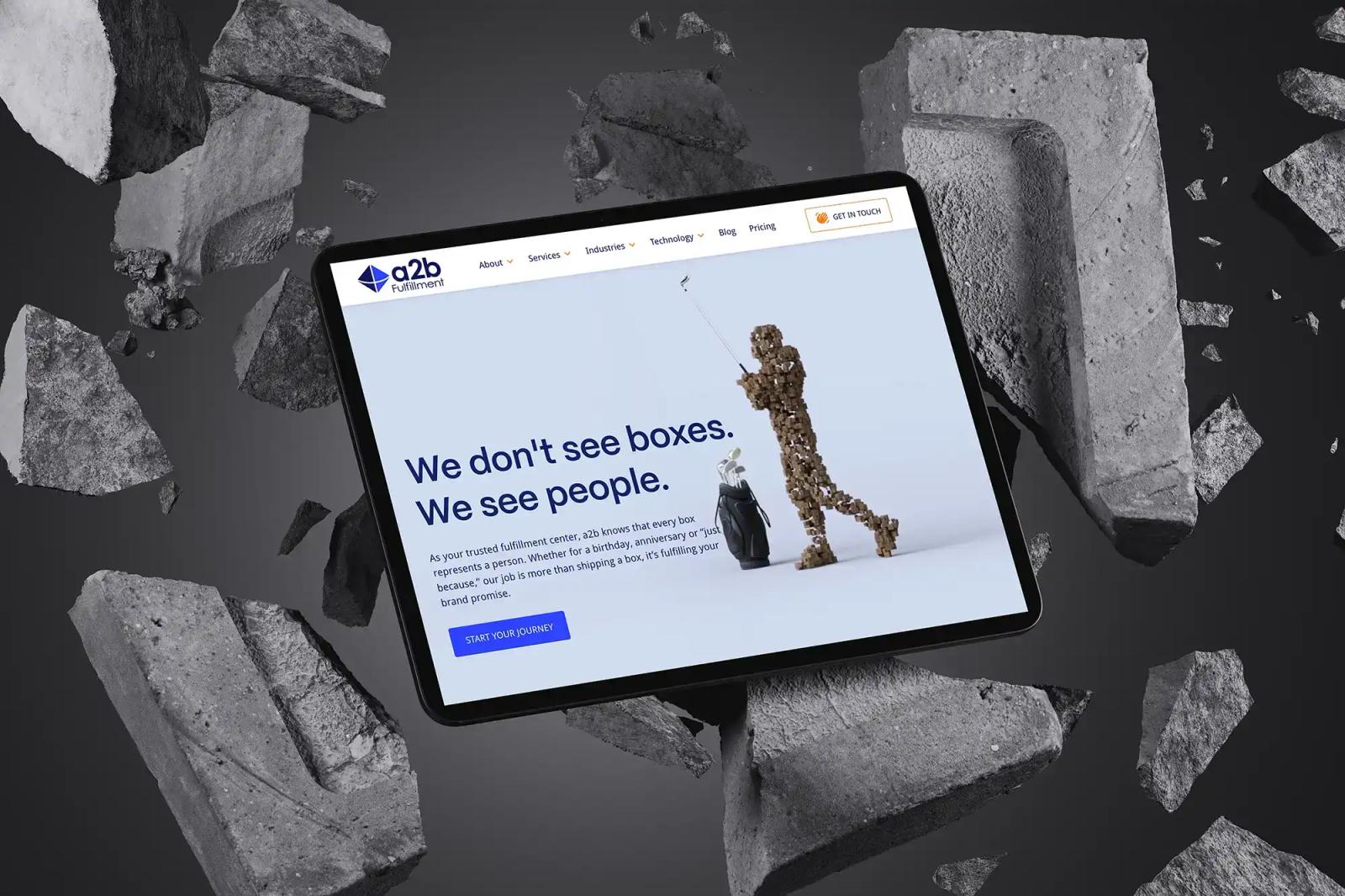
The a2b Fulfillment homepage on a tablet surrounded by floating concrete fragments.

a2b Fulfillment

A person behind every box

Supply ChainView live website
Introduction

a2b Fulfillment helps businesses streamline their operations with a suite of third-party logistics services, specializing in order fulfillment, value-added services, and customer care solutions for a variety of industries.
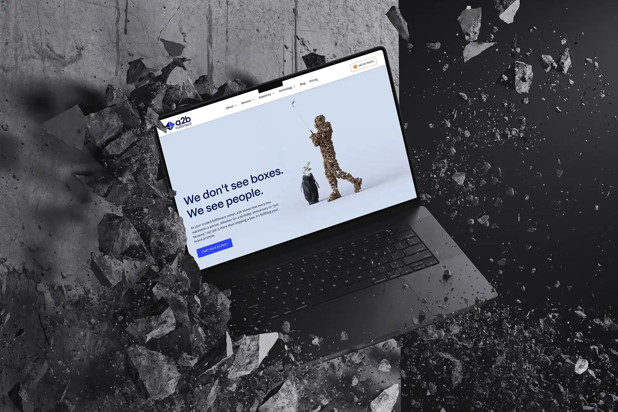
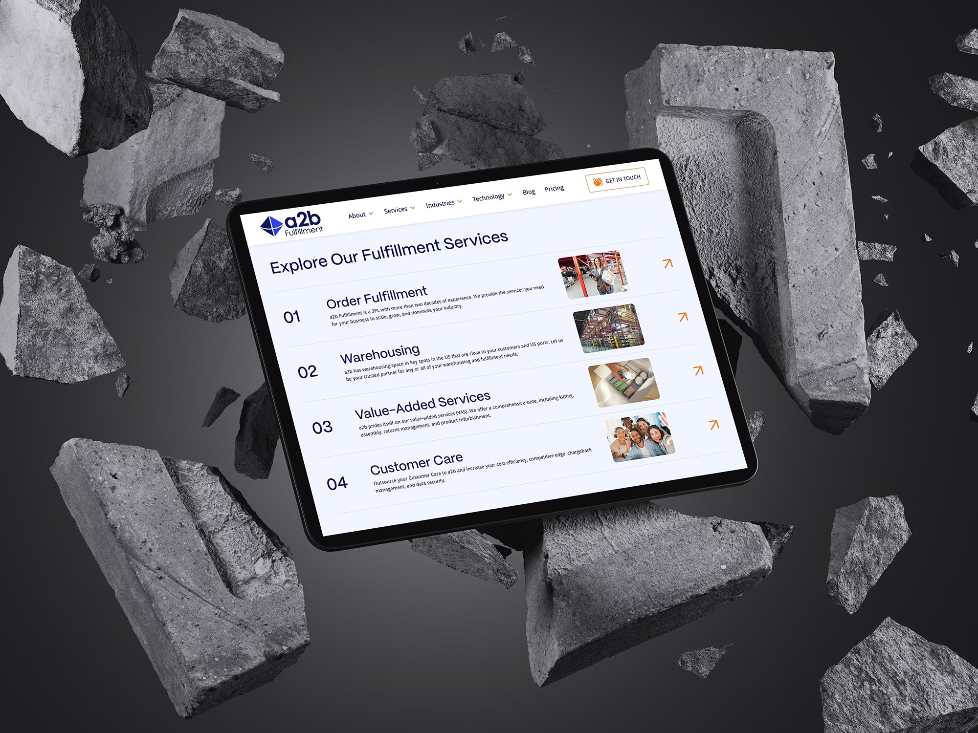
The a2b Fulfillment homepage on a laptop bursting through a cracked concrete wall.The a2b Fulfillment services page on a tablet, listing order fulfillment, warehousing and customer care.
The Challenge

The Challenge

a2b Fulfillment’s previous website didn’t reflect their size or capabilities. As is often the case with early stage websites, the site was difficult to manage, lacked visual appeal, and failed to differentiate them from competitors, limiting its effectiveness as a key marketing tool.
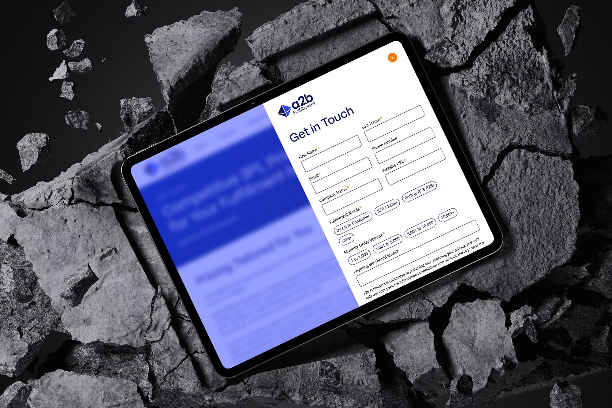
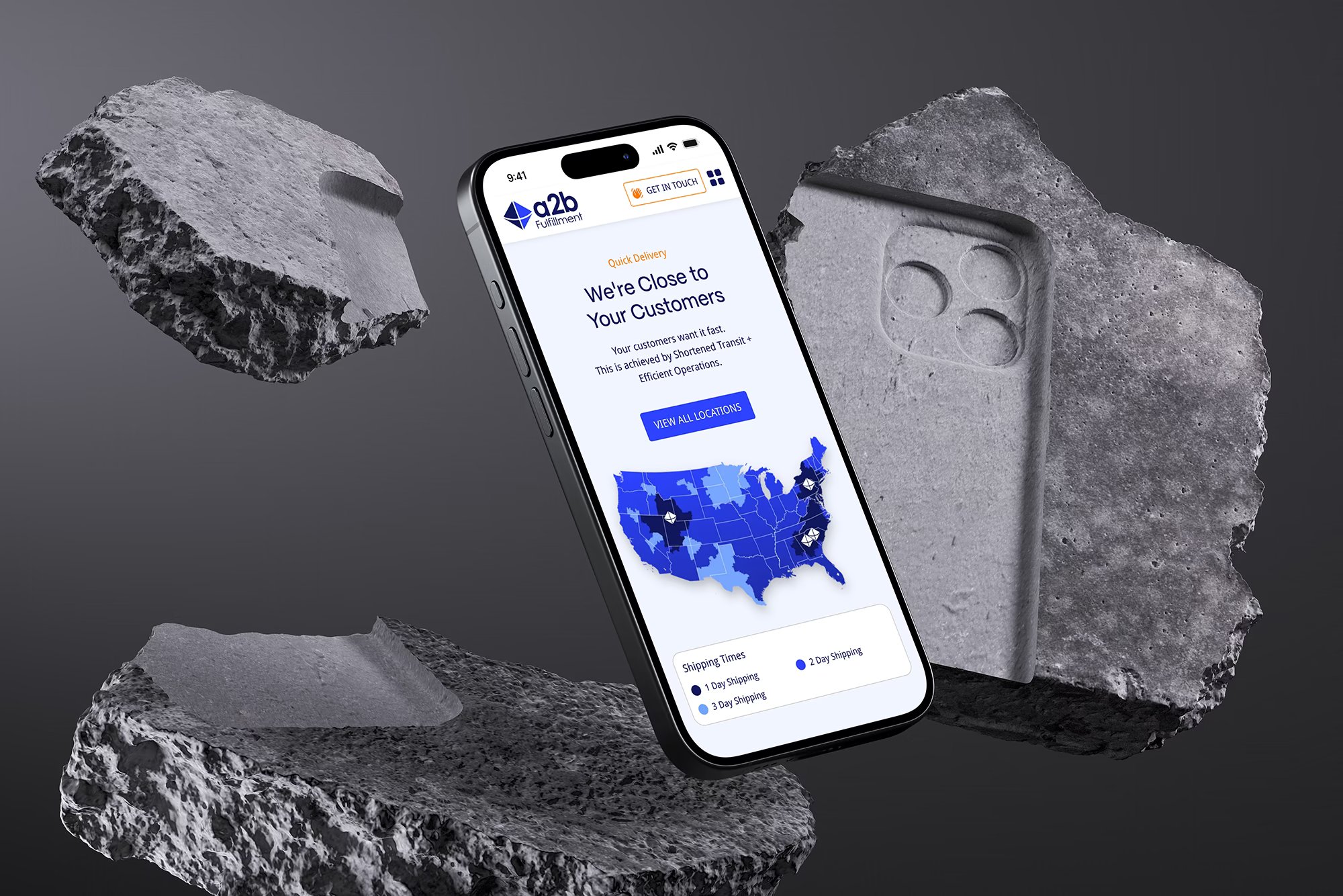
The a2b Fulfillment "Get in Touch" contact form on a tablet resting on cracked concrete.A phone showing the a2b Fulfillment "We're Close to Your Customers" page with a US shipping map.
The Solution

The Solution

The new website focused on highlighting a2b Fulfillment’s unique value with a combination of strong imagery and storytelling to reinforce their core message of “We Don’t See Boxes, We See People,” while improved navigation helped users find the information they needed more easily.
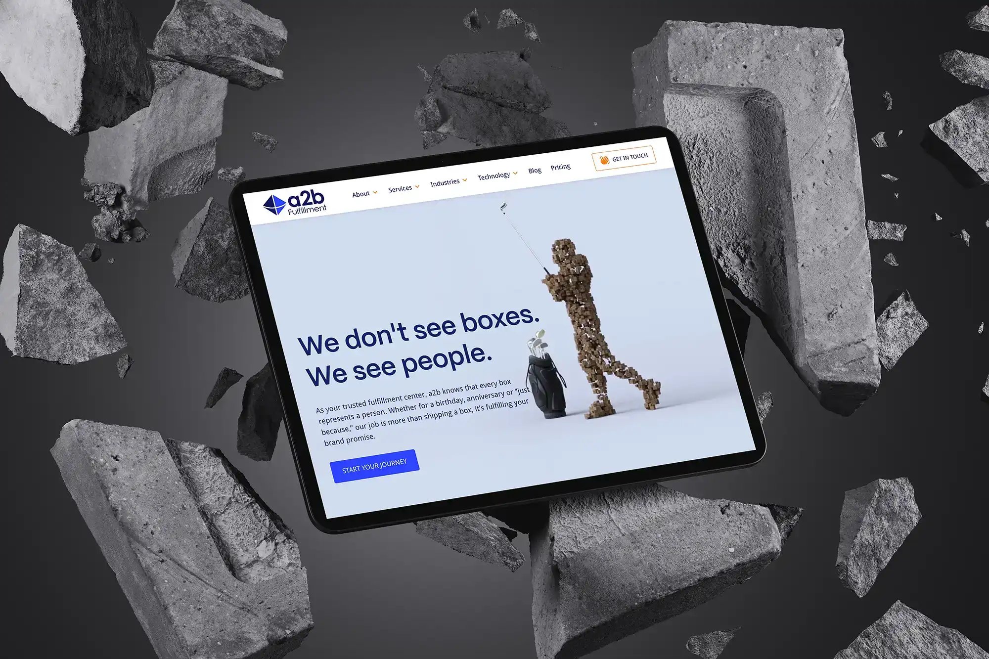
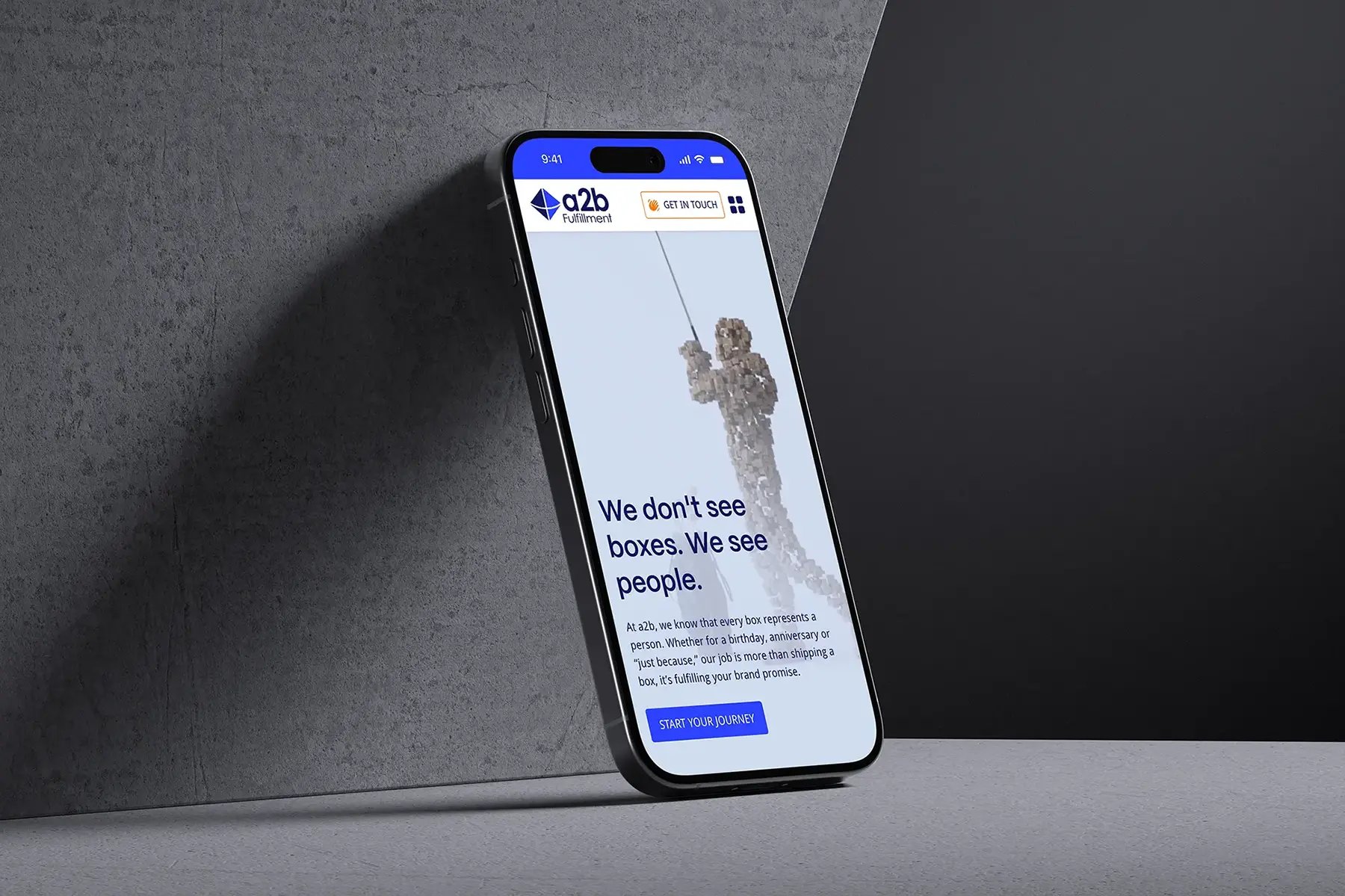
Tablet close-up of the a2b Fulfillment "We don't see boxes" headline beside a figure made of boxes.The a2b Fulfillment mobile homepage on a phone leaning against a concrete wall.
Brand Identity

Brand Identity

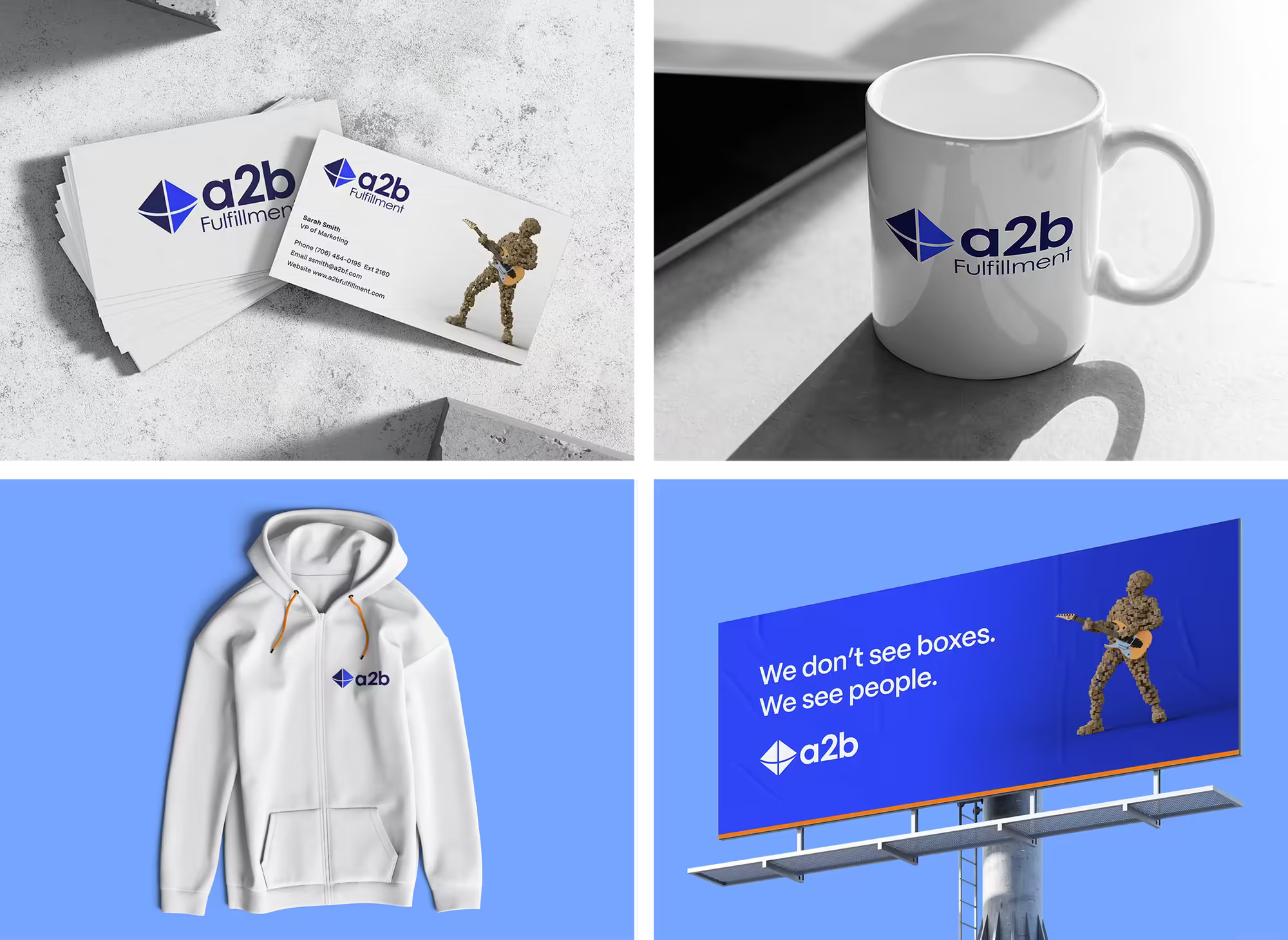
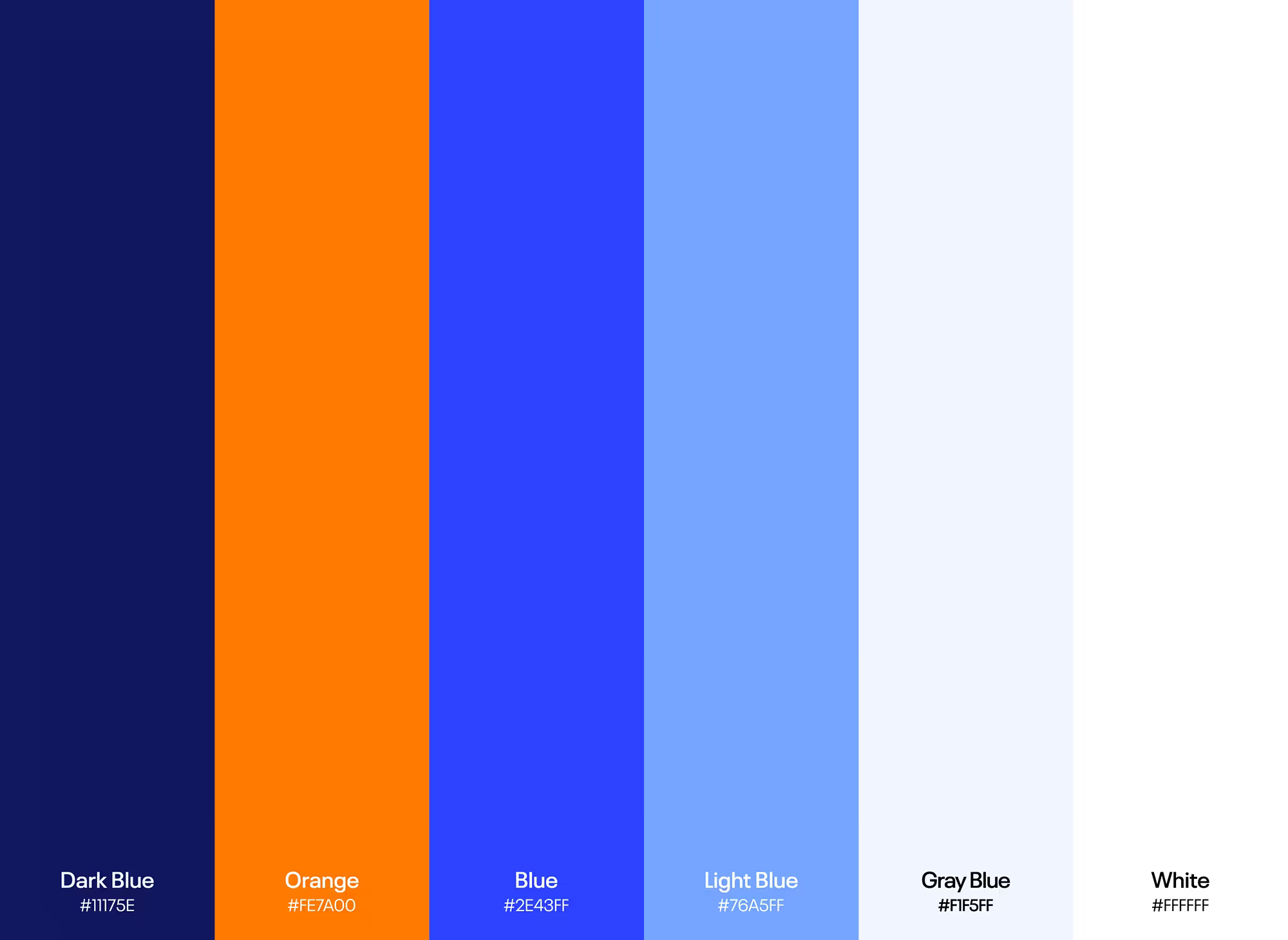
a2b Fulfillment’s modernized logo and refreshed color palette created a more flexible and contemporary brand identity. The visual campaign brought their human-centered approach to life, using thoughtful design and imagery to convey their values and unique positioning in the logistics space.
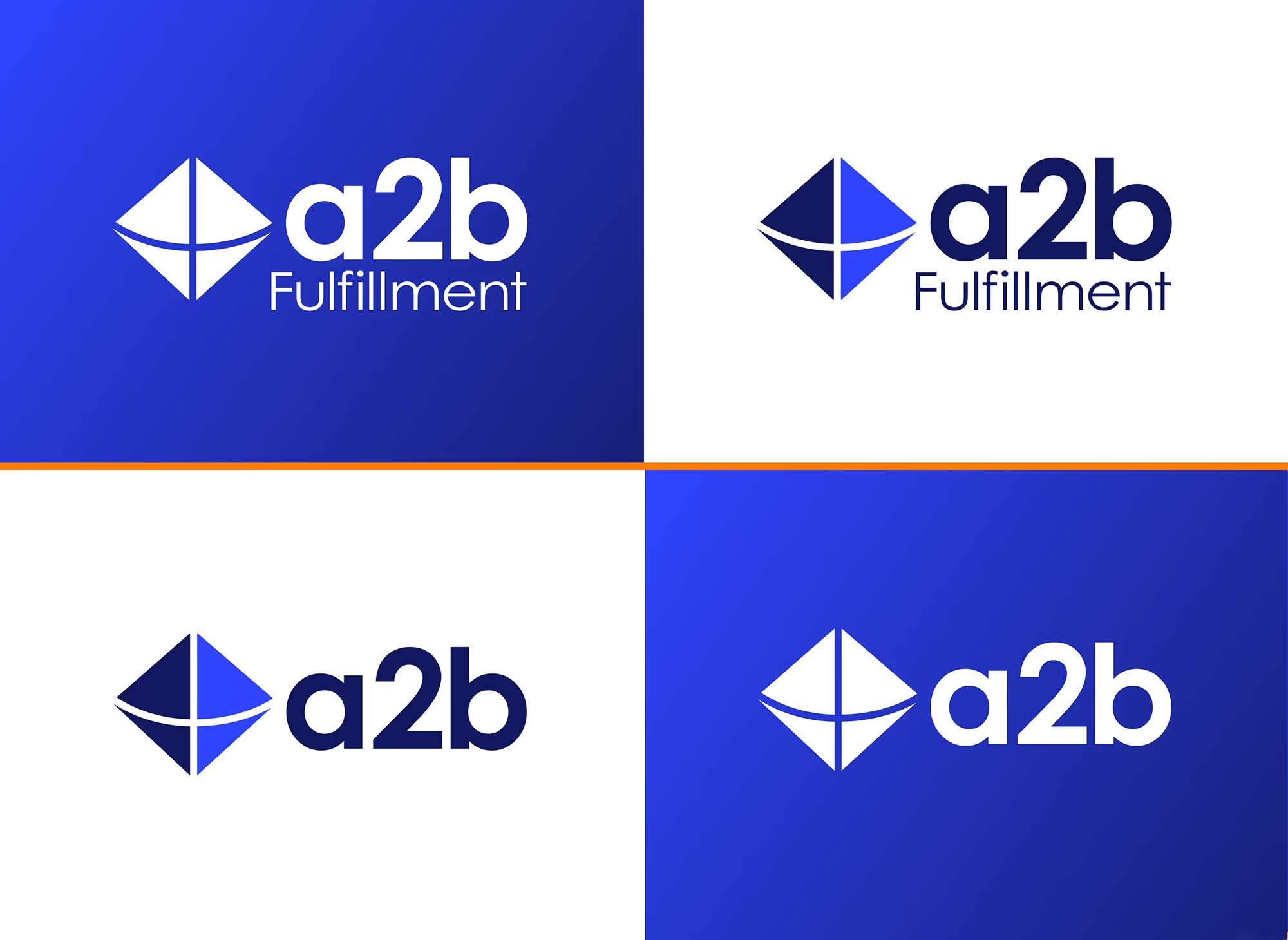
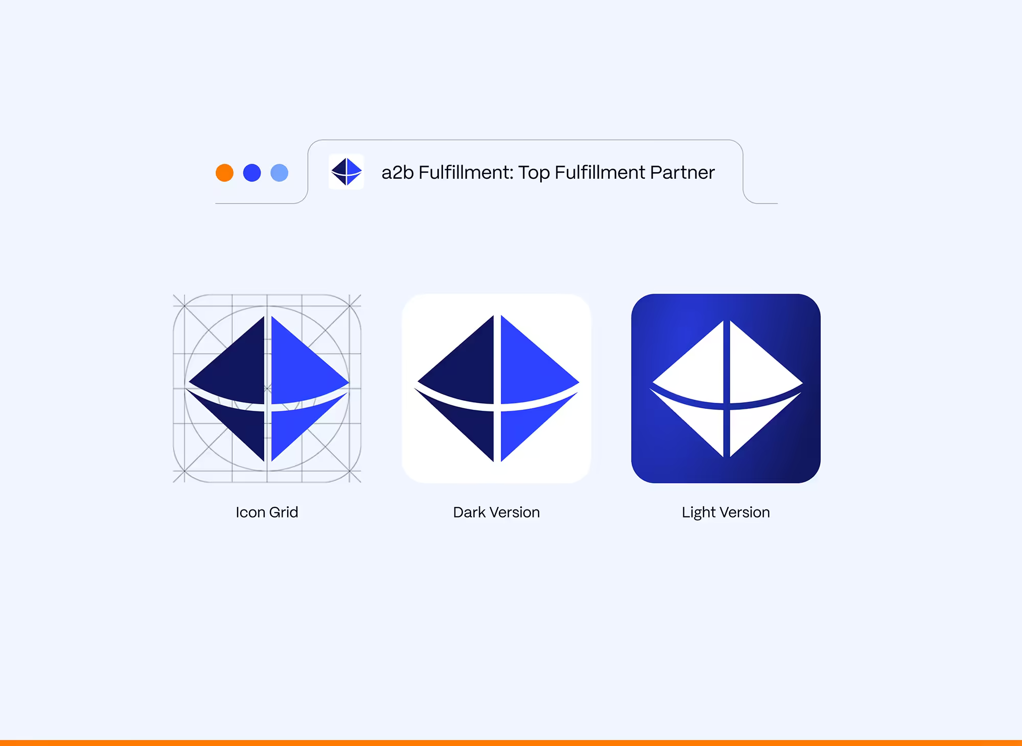
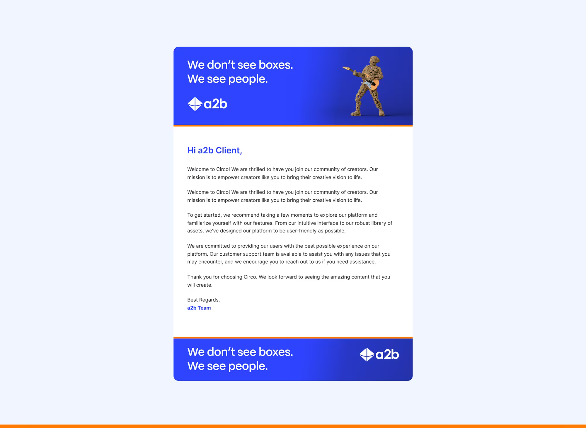
The a2b Fulfillment logo in full and short versions on blue and white backgrounds.The a2b Fulfillment diamond icon shown on its construction grid and in dark and light versions.Close-up of a browser tab and address bar with the a2b Fulfillment icon and name.Business cards, a mug, a hoodie and a billboard carrying the a2b Fulfillment brand.The a2b Fulfillment color palette of dark blue, orange, blue, light blue, gray blue and white.Brand portraits of three people against the a2b Fulfillment blue, in light and dark shirts.Photo grid for a2b Fulfillment of packers, conveyors, warehouse shelving and customer care agents in headsets.An a2b Fulfillment email template with "We don't see boxes" header and footer banners.
Before / After

Before / After

The redesigned site featured improved landing pages for ad traffic, better organization of industries served, and realigned service categories to better reflect their offerings. The result was a more intuitive and enjoyable user experience that effectively communicated a2b Fulfillment’s capabilities.
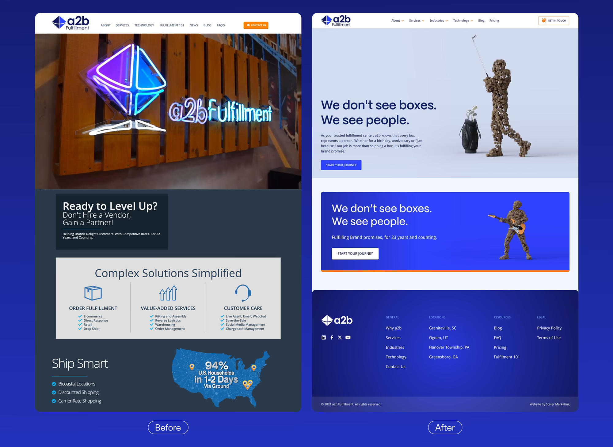
The a2b Fulfillment website before and after the redesign, from a dark neon-sign homepage to a light hero.

Envision your brand at work

Want to Unleash
Your Brand?

Start a Project