5 Things Every Scientific Website Should Be Doing in 2026

Your website might be "fine."
It loads. It lists your services. It has a contact form.
But in 2026, fine isn't enough. Your competitors are investing in their digital presence. Your buyers are doing more research before they ever reach out. And the bar for what a "good" scientific website looks like has shifted.
Here are five things we think every scientific company should be doing with their website this year — and most aren't.
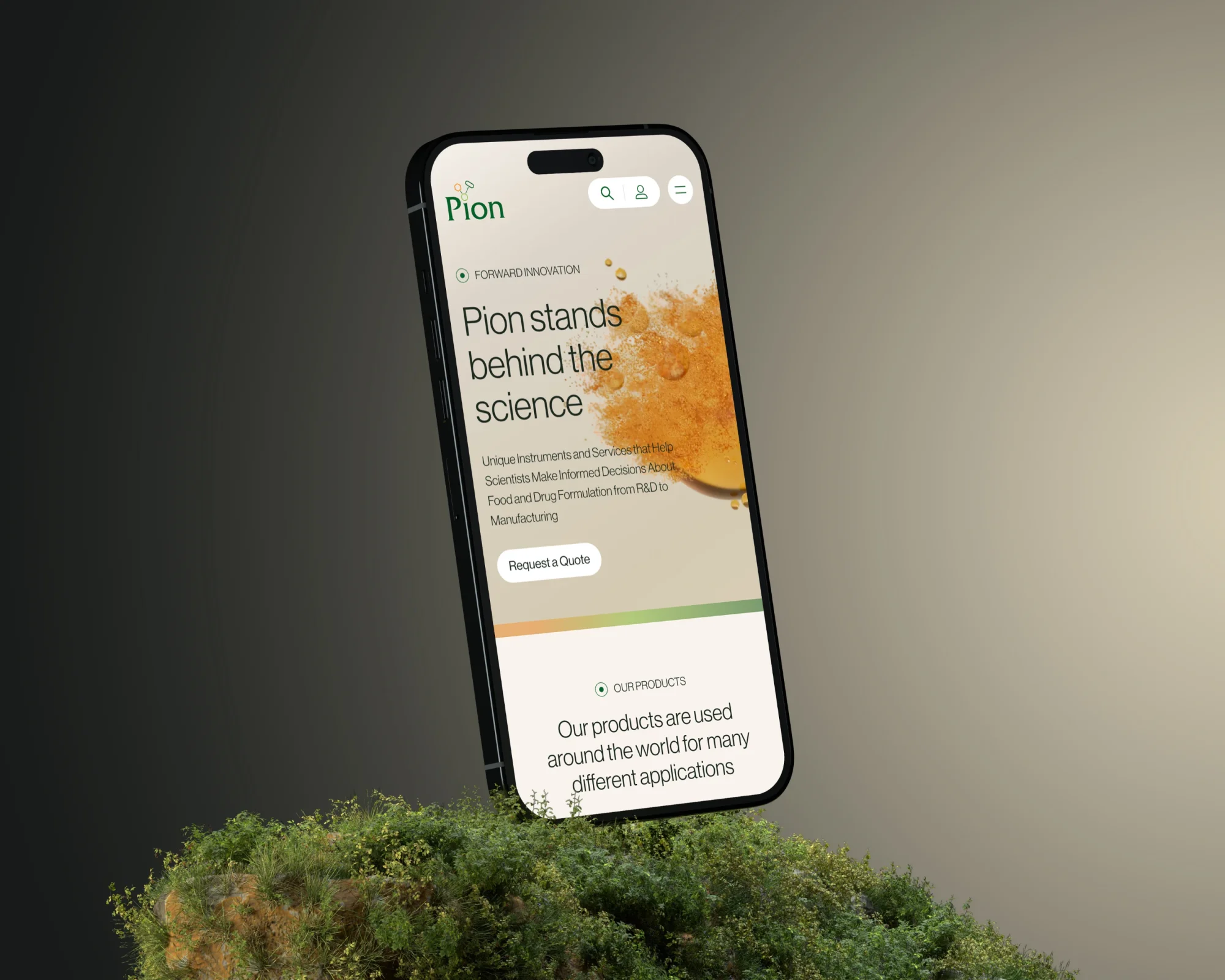
1. Lead with impact, not methodology
Scientists are trained to communicate backwards.
Read any scientific poster or peer-reviewed paper: the first line is the most complex sentence on the page. Methods, materials, technical details — and then, buried at the very bottom, the thing that could actually change the world.
That's great for peer review. It's terrible for your website.
Your visitors aren't reviewers. They're potential customers, partners, investors — humans who want to feel something before they think something. They want to know why this matters before they dig into how it works.
Lead with the dream. The outcome. The problem you solve. Then, if they're interested, give them the details.
Most scientific websites get this exactly backwards. Flip it.
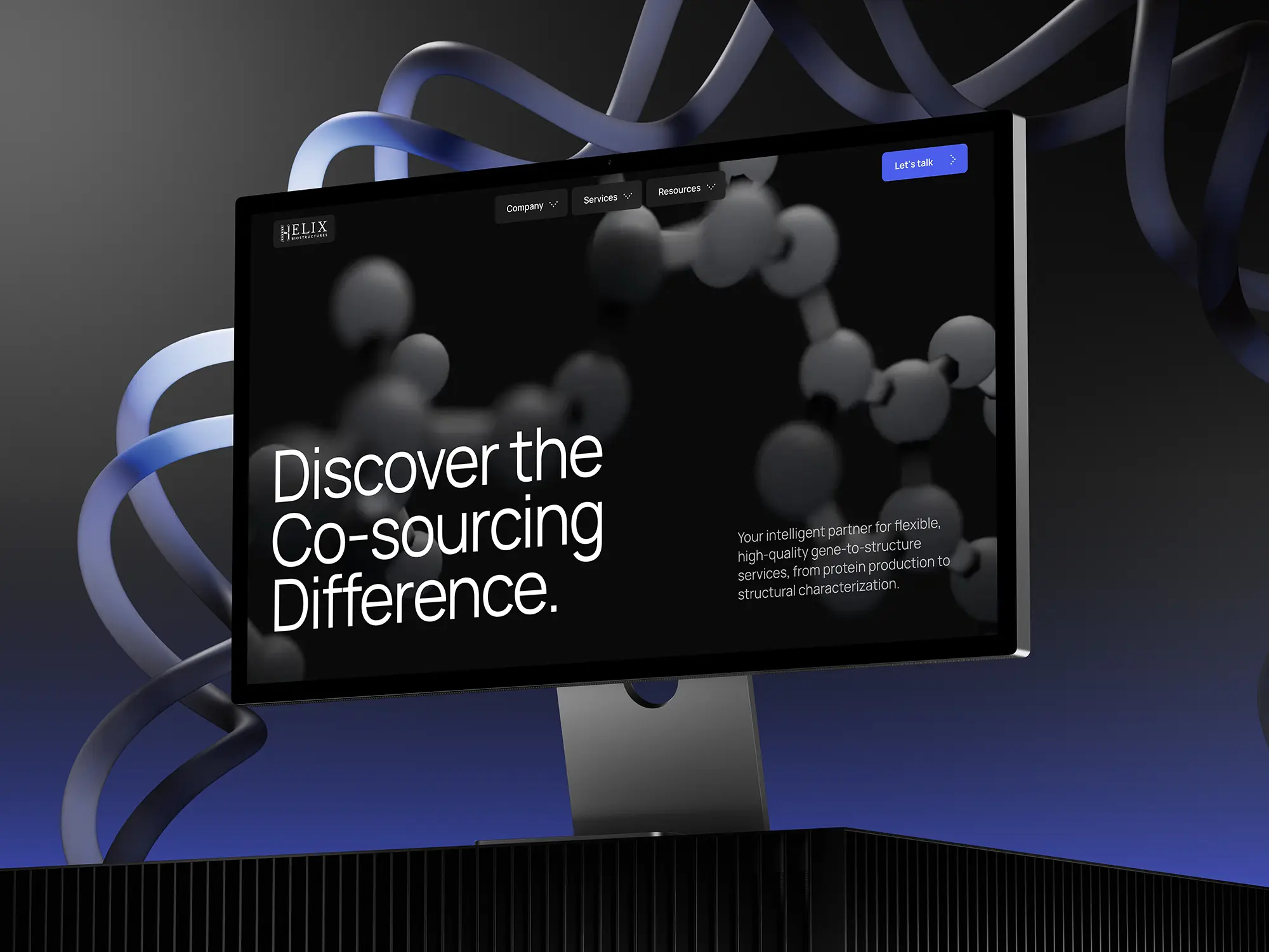
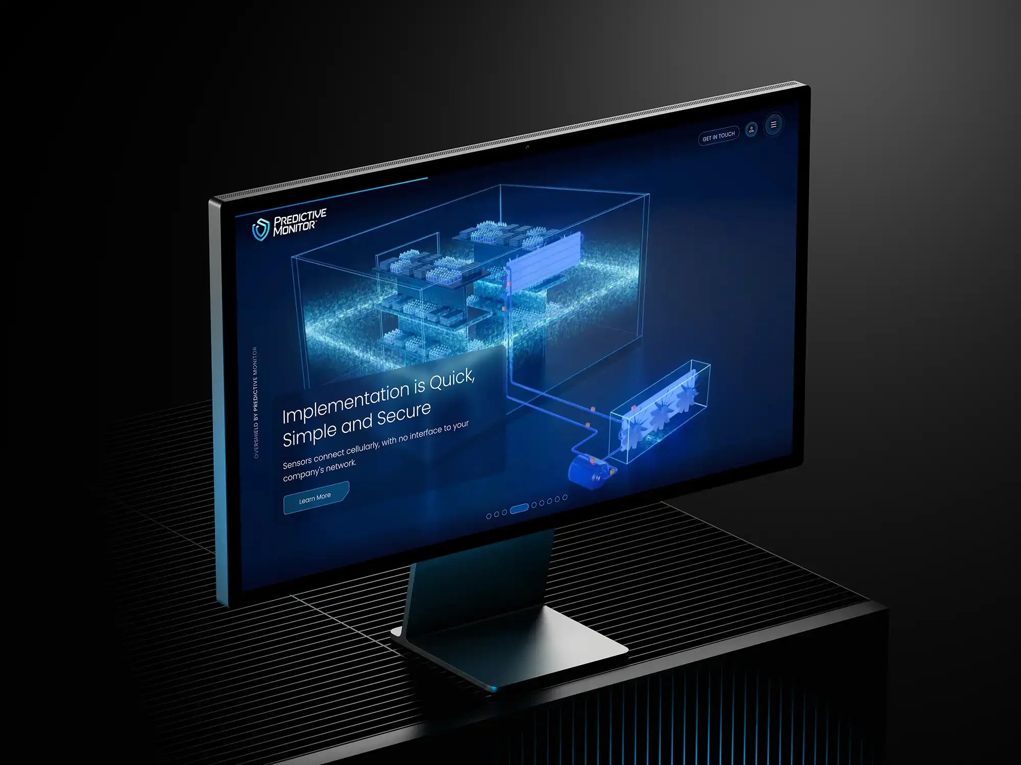
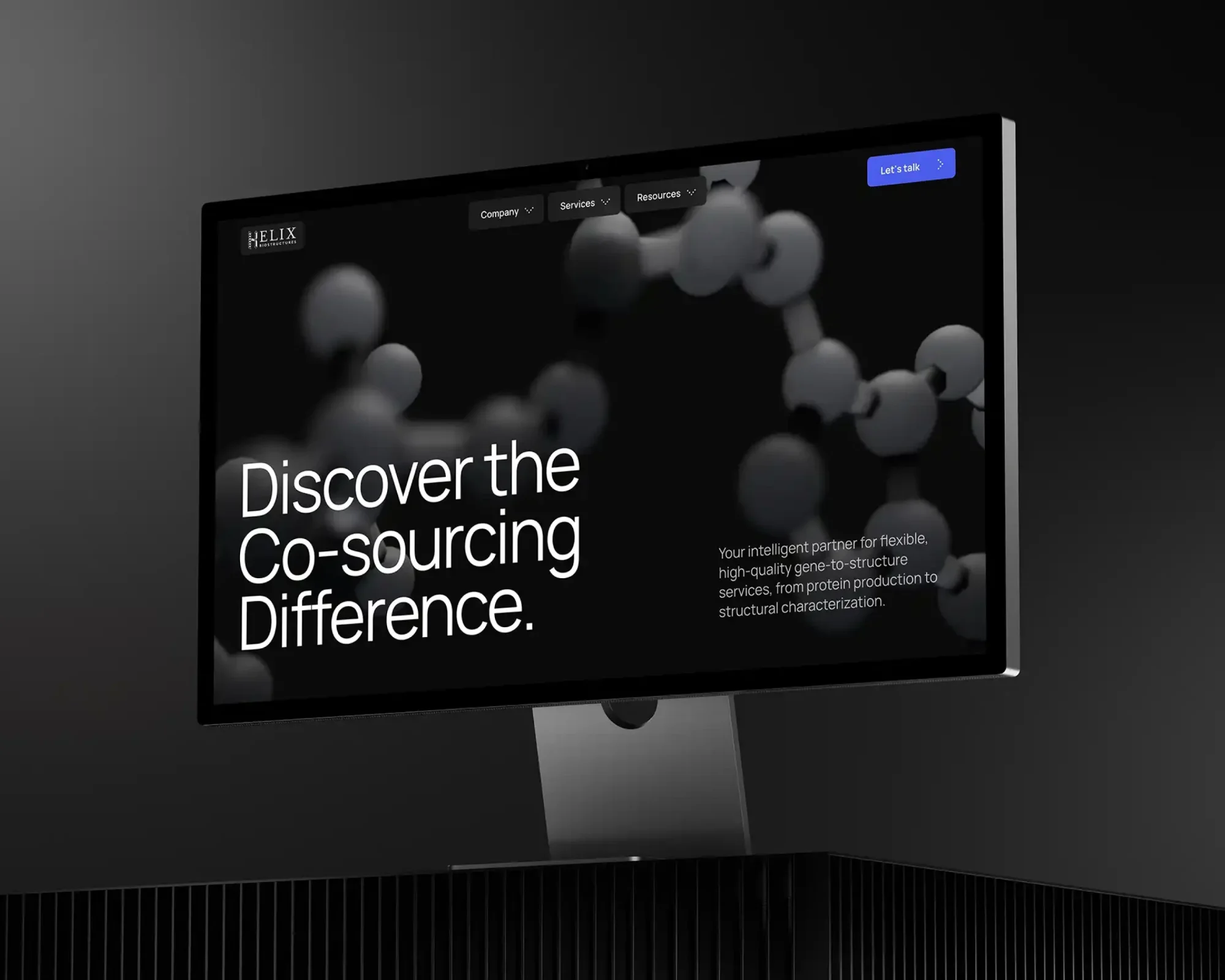
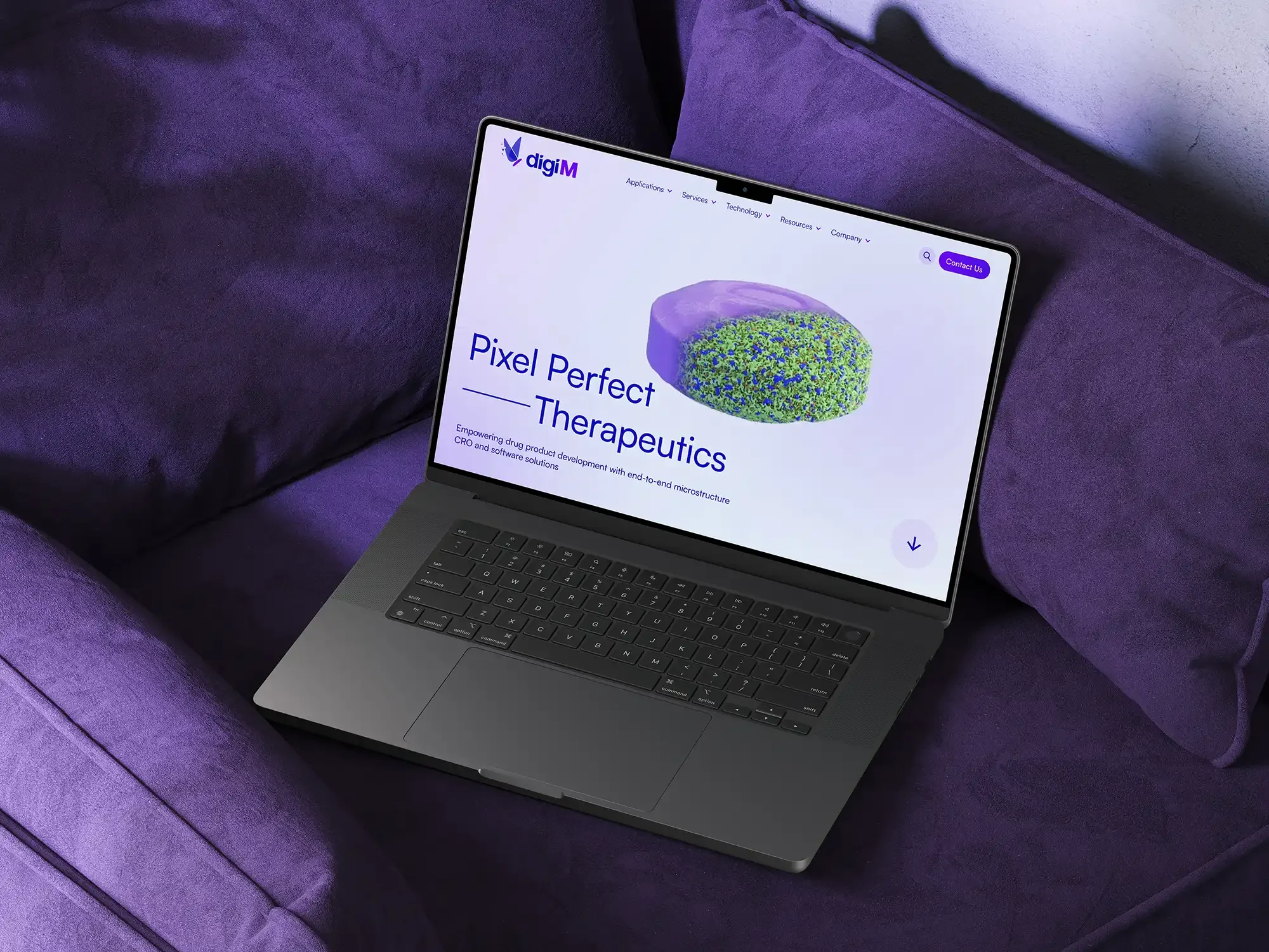
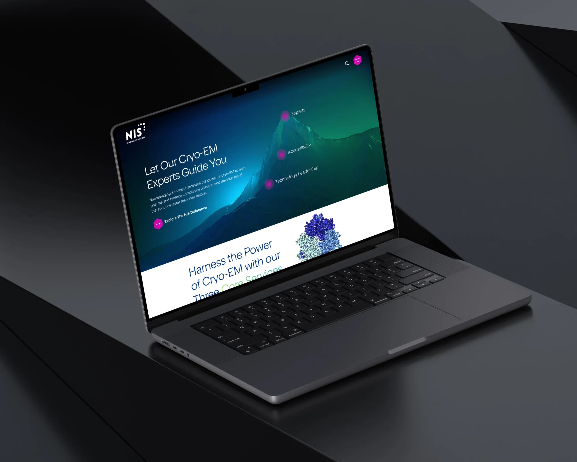
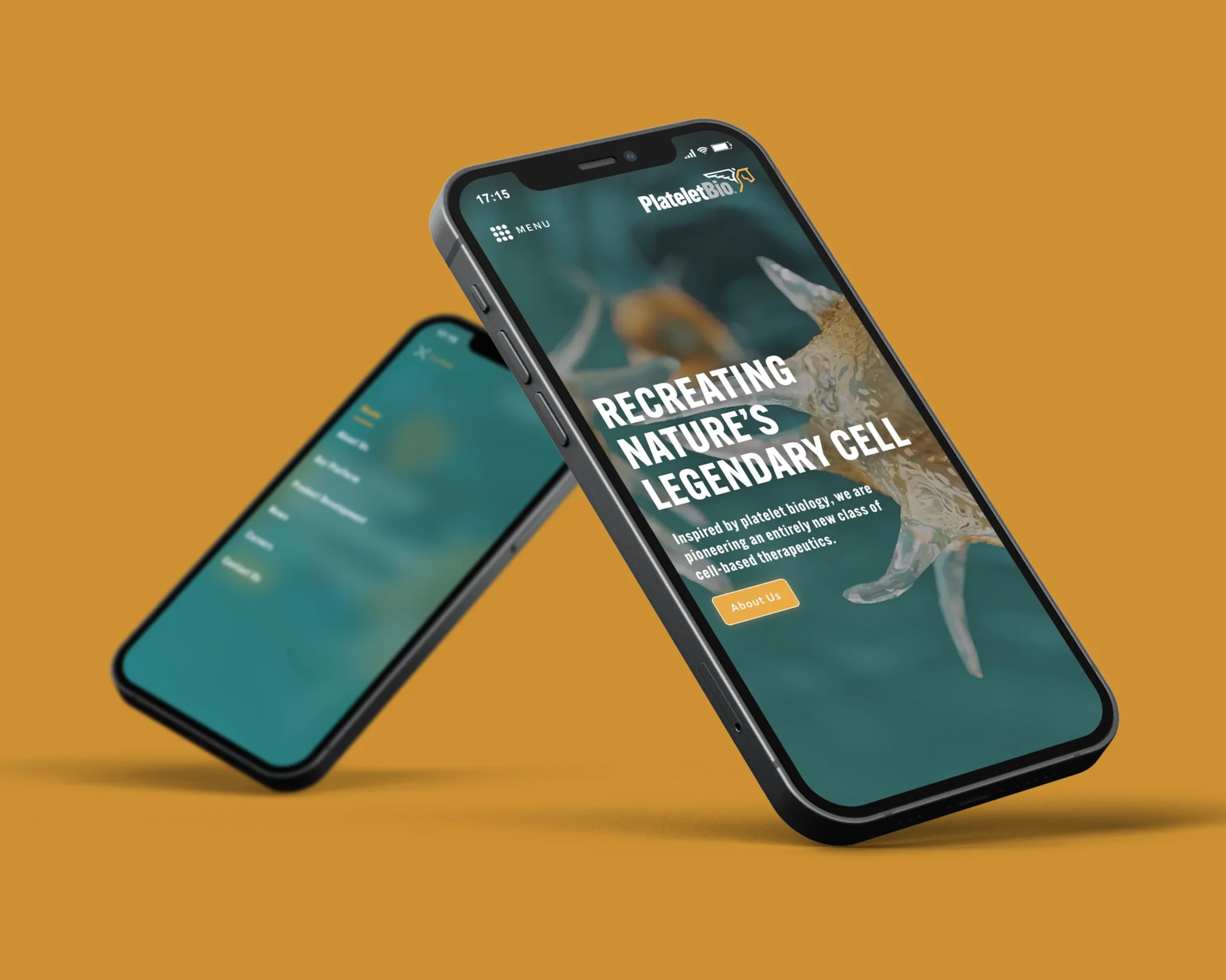
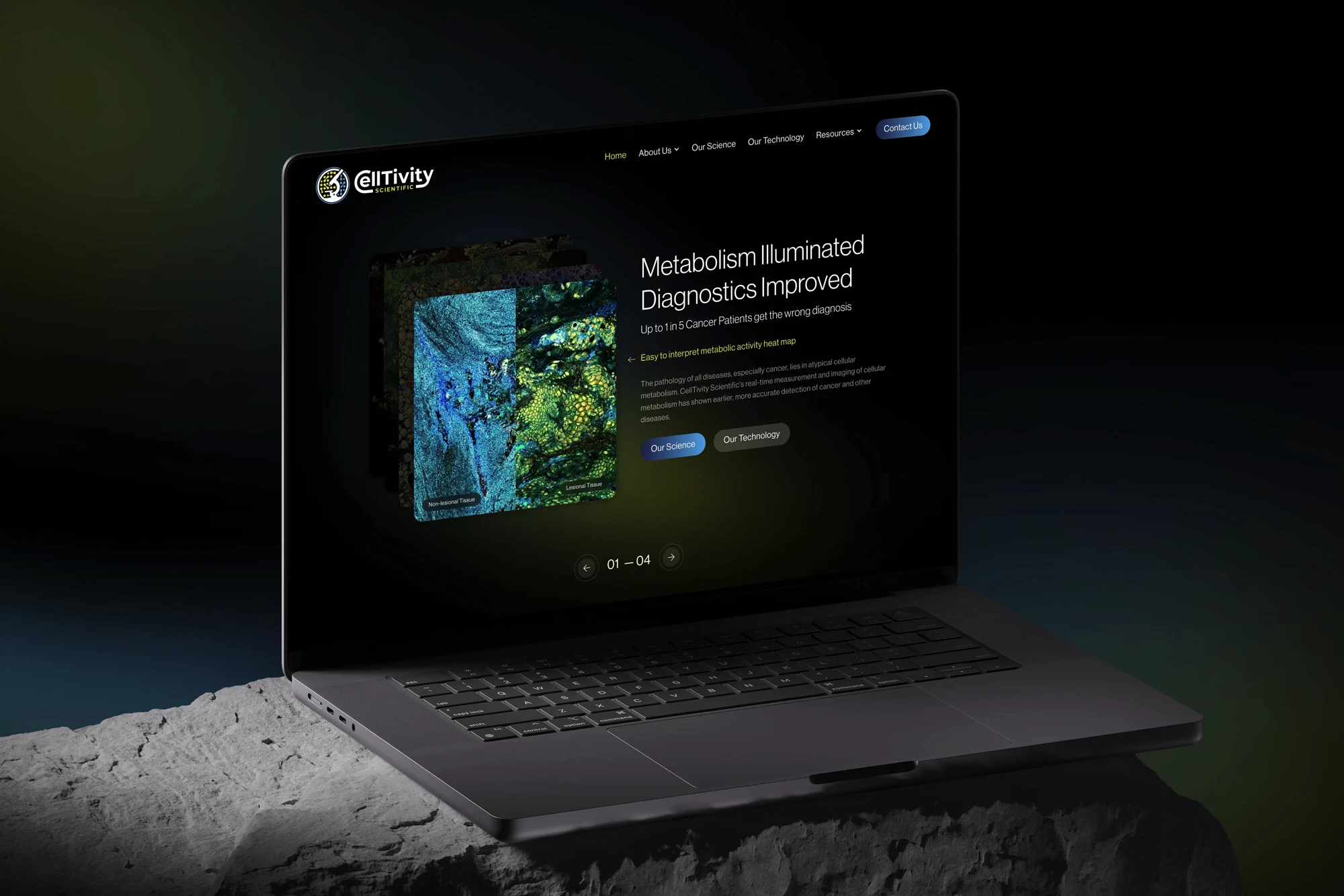
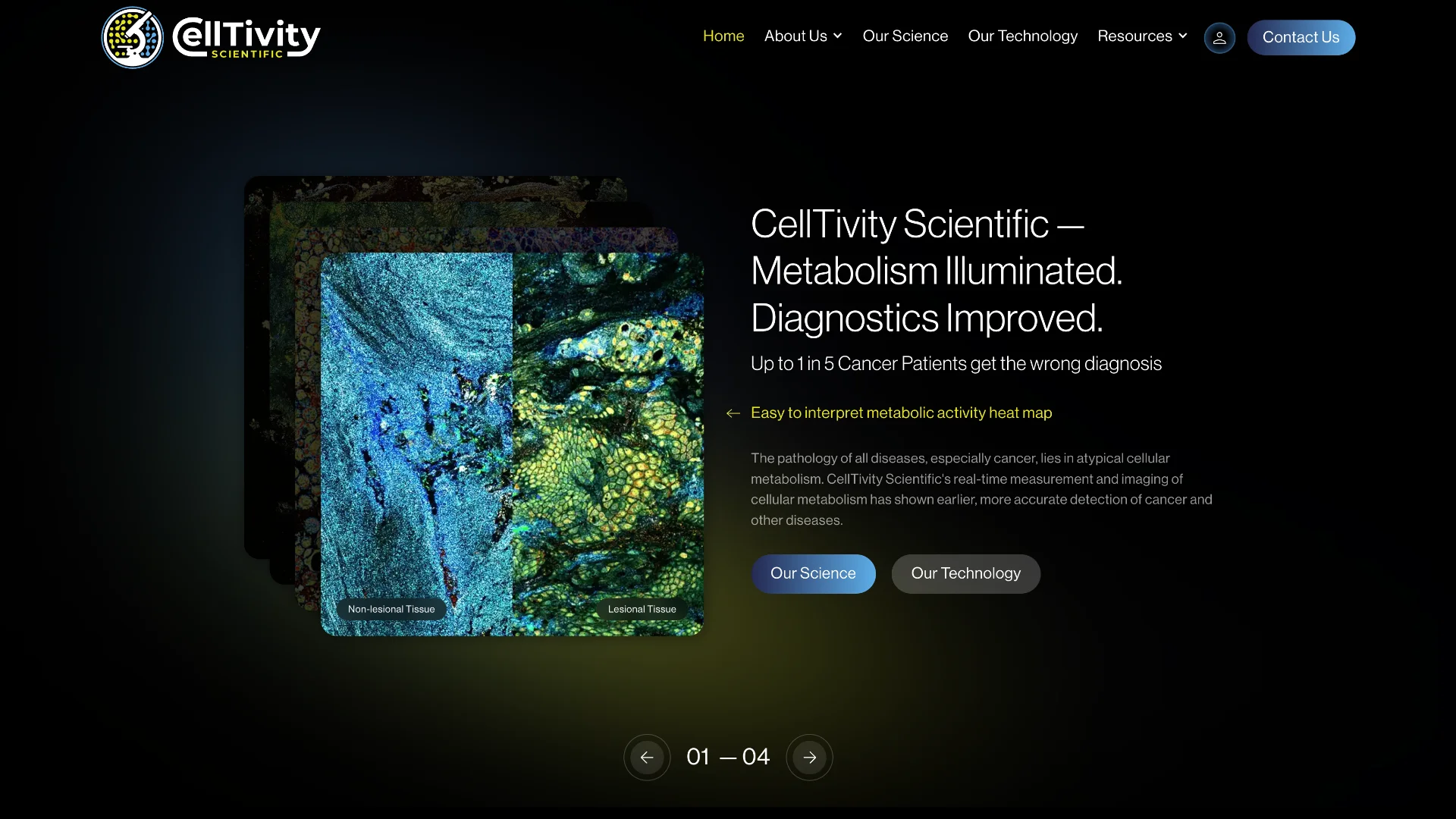
2. Show your work — literally
You do sophisticated, complex, often beautiful work. Your website probably describes it in a wall of text.
What if people could see it instead?
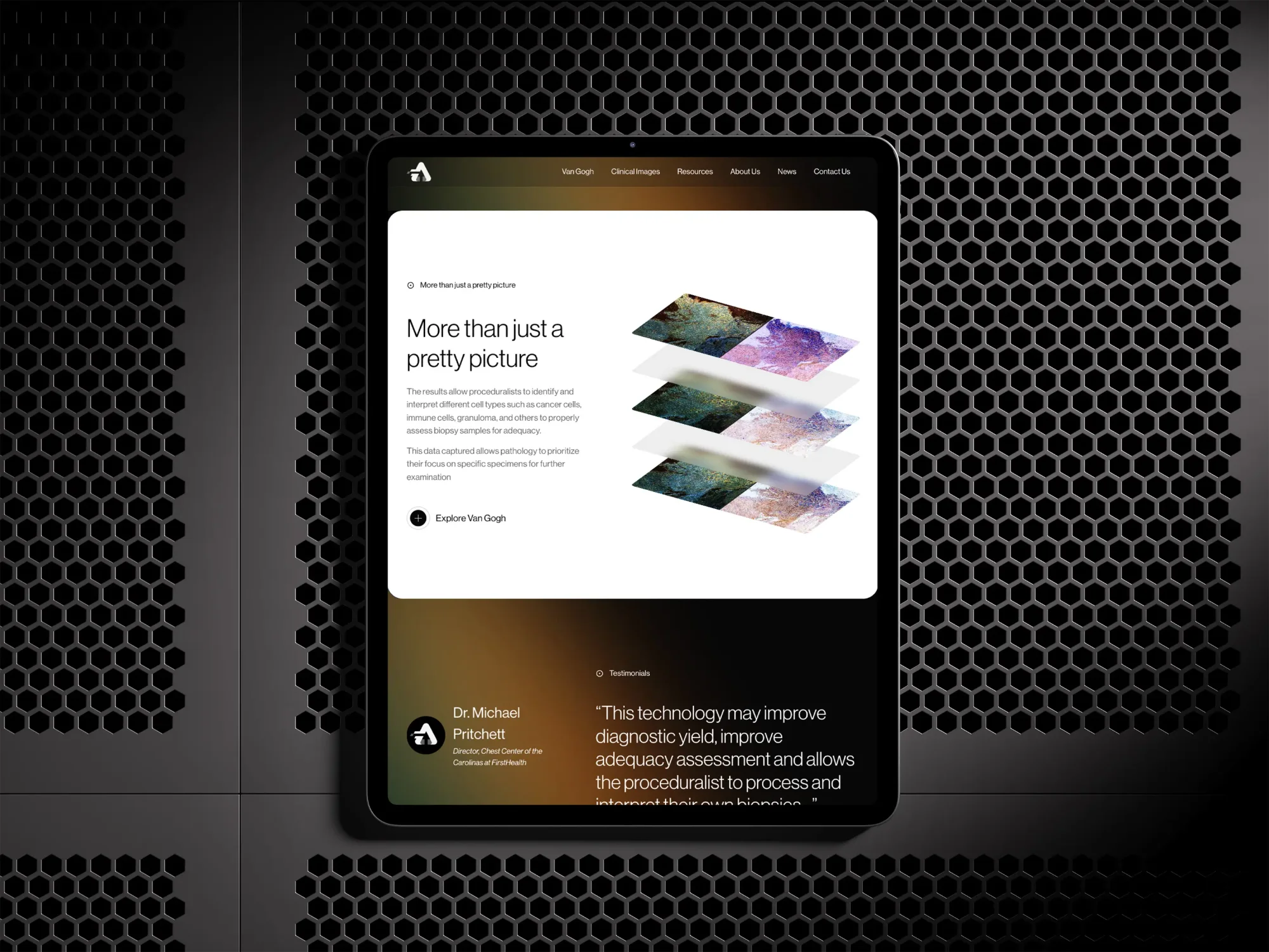
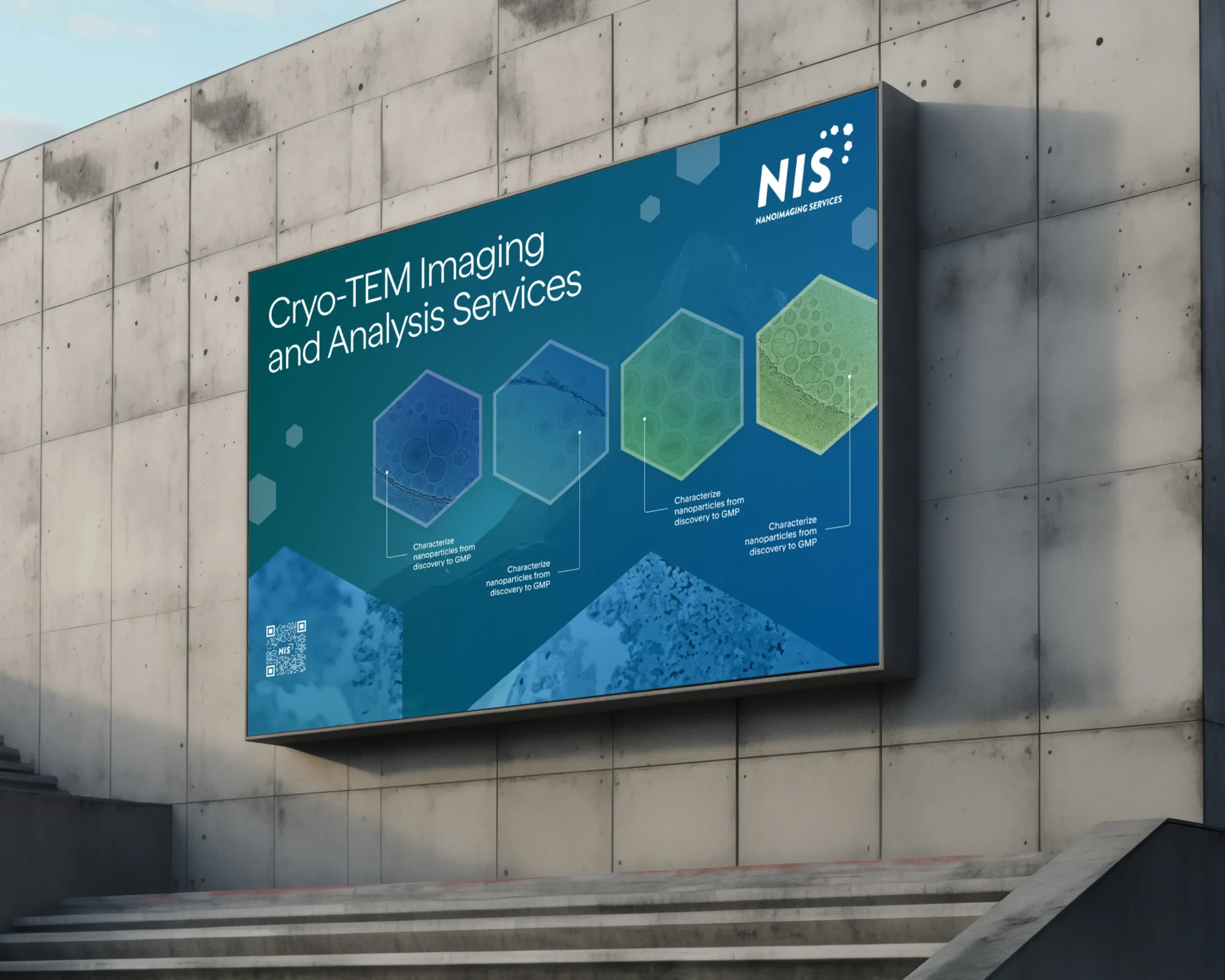
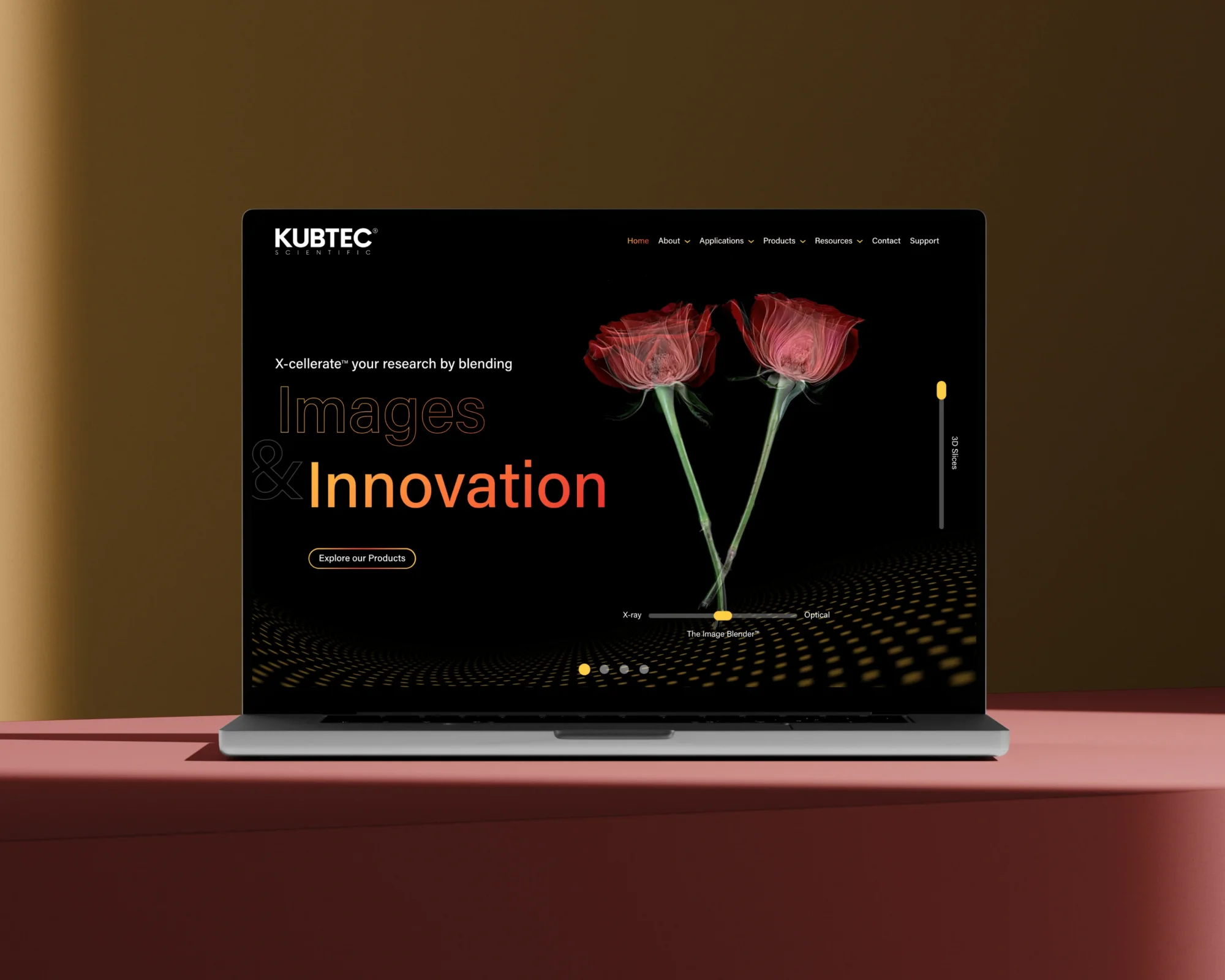
We've seen this work over and over: a company takes their stunning diagnostic imaging from a PDF to their homepage. A cleanroom manufacturer actually shows their modular build process assembling piece by piece instead of describing it in paragraphs. A structural biology company uses their molecular renderings as the visual centerpiece of their site instead of stock photos of a scientist holding a pipette.
Your capabilities are visual. Your process is visual. The science itself is often visually stunning.
Use that. Show the 3D renderings. Animate the process. Let your actual work be the hero of your homepage instead of hiding it three clicks deep.
3. Write like a human
AI is everywhere now. Which means the human touch matters more than ever.
If your website copy could have been written by any company in your space — if you swapped out the logo and it would still make sense — you have a voice problem.
This doesn't mean being unprofessional. It means having a point of view. It means writing the way your best salesperson actually talks to prospects. It means cutting the jargon that makes you sound like everyone else.
"Innovative solutions for complex challenges" says nothing. What do you actually do? Who do you help? What's different about working with you?
Say that instead. In words a human would actually use.
4. Make the next step obvious
Someone lands on your site. They're interested. They want to learn more, maybe talk to someone.
What do they do?
On most scientific websites, the answer is: hunt around for a contact page and fill out a generic form that feels like it's going into a void.
That's friction. And friction kills momentum.
Every page should have a clear next step. Not just "Contact Us" — something specific. "Schedule a consultation." "Download the case study." "See how it works." Make it easy for people to raise their hand, and make it clear what happens when they do.
Your website should help your sales team, not work against them.
5. Treat your website like a product, not a project
Most companies treat their website like a one-time project. Build it, launch it, forget about it for three years until it feels embarrassingly outdated.
But your website isn't a brochure. It's a living product — one that should evolve as your company evolves, as your market shifts, as you learn what resonates with your audience.
That means building in a way that allows for iteration. Updating messaging when you find better language. Adding case studies as you close new work. Testing different approaches to see what actually converts.
The companies with the best websites aren't the ones who spent the most on a redesign. They're the ones who keep showing up, keep refining, keep treating their site as something worth investing in continuously.
Small, consistent improvements beat a big reveal every time.
The bottom line
None of this is about chasing trends or adding flashy features for their own sake. It's about building a website that actually does the work it's supposed to do: attract the right people, communicate what makes you different, and make it easy to take the next step.
If your site is "fine" but you know it could be doing more, start with one of these five. See what shifts.
And if you want a second set of eyes, we're always happy to take a look.