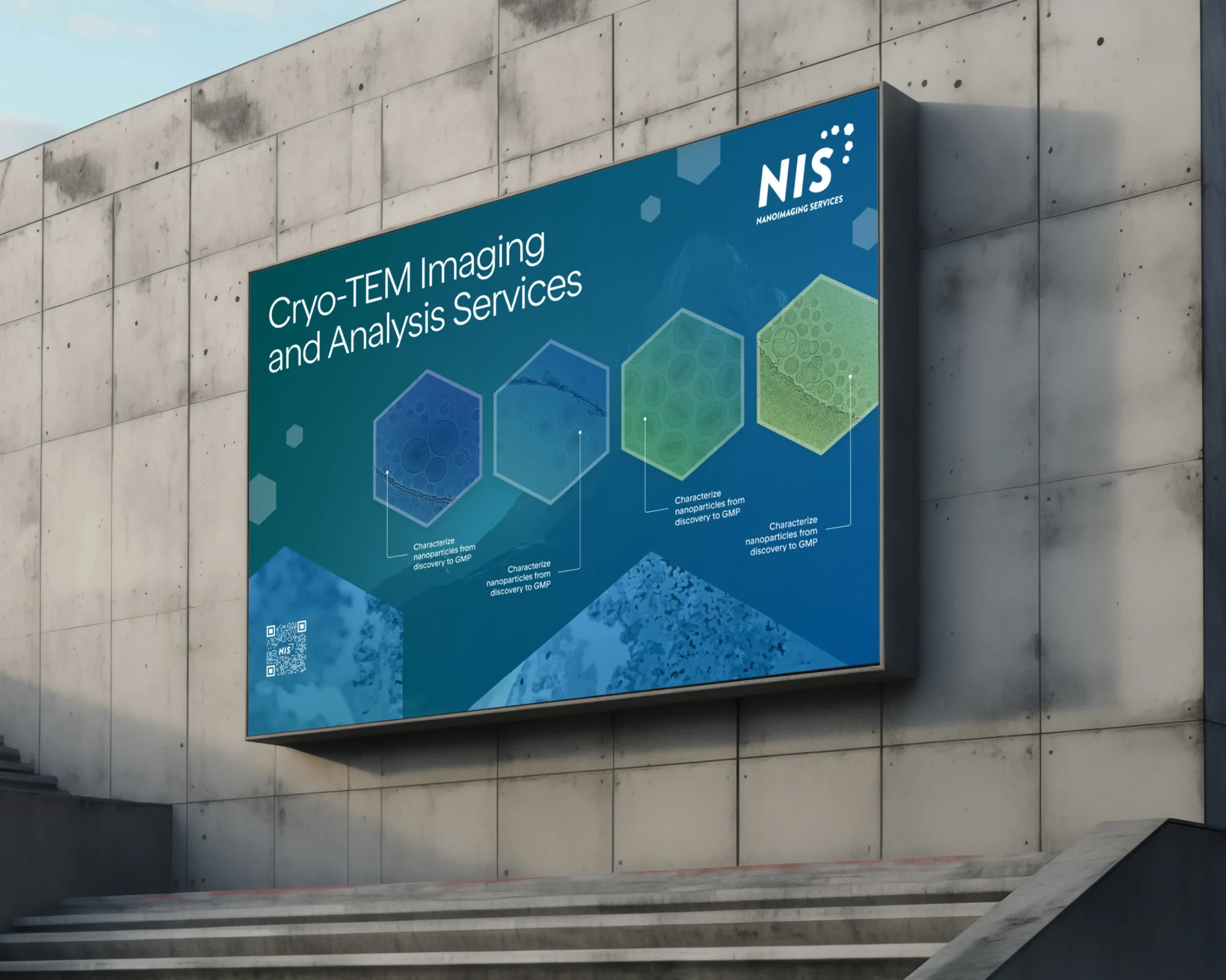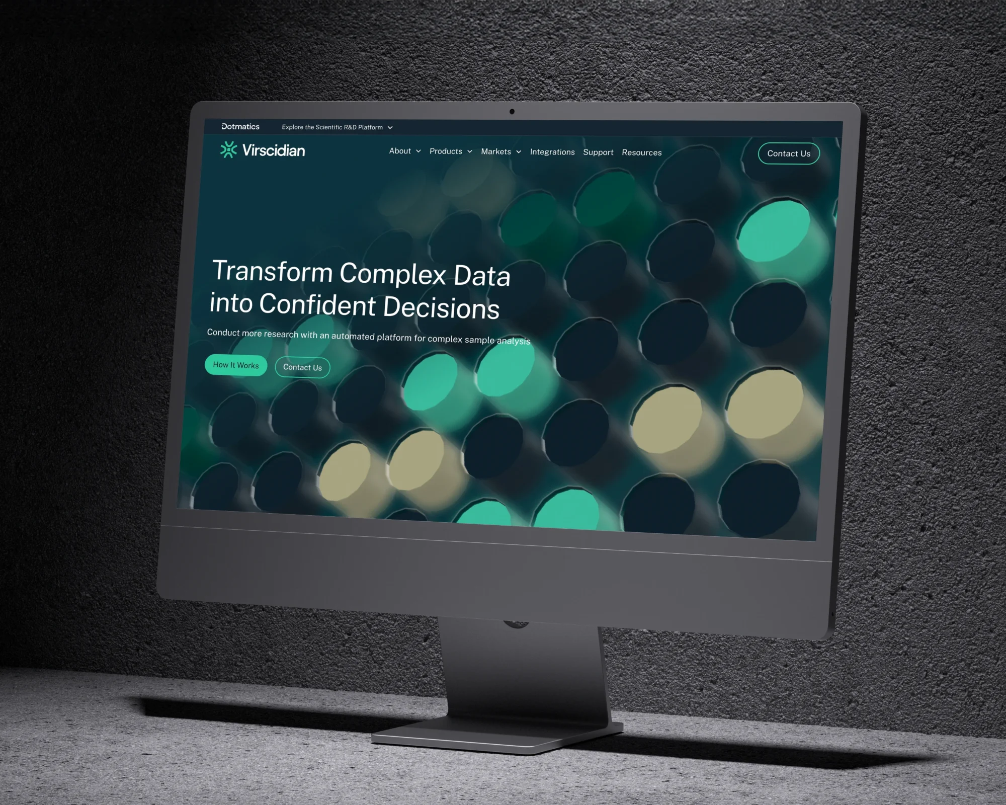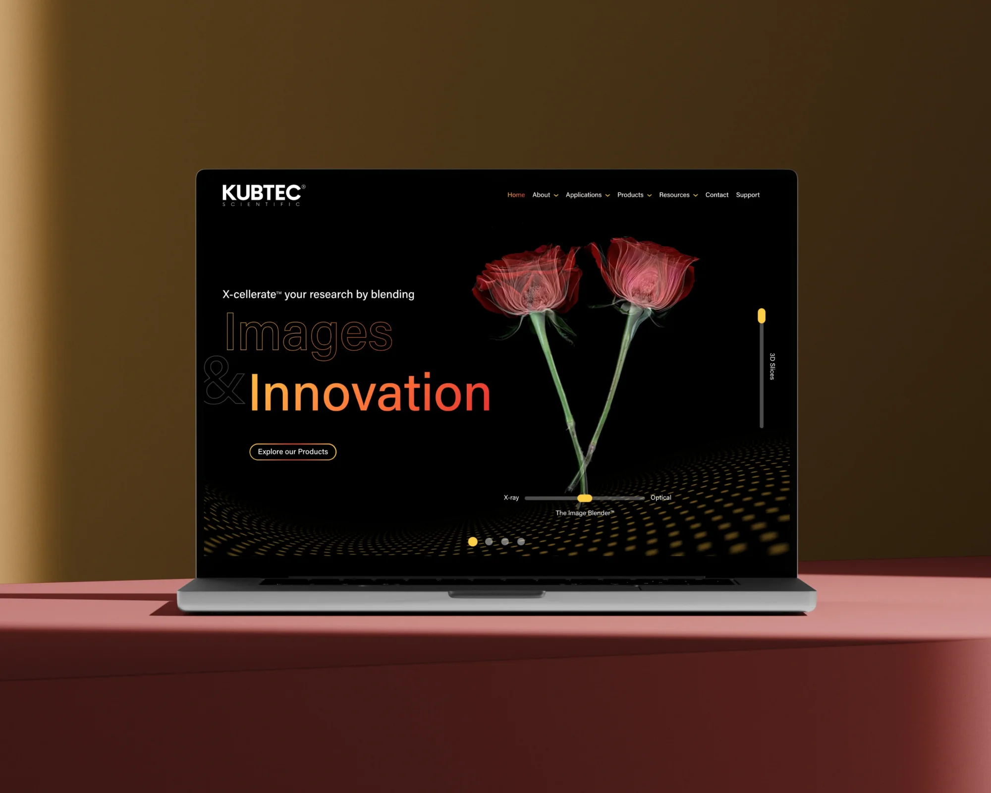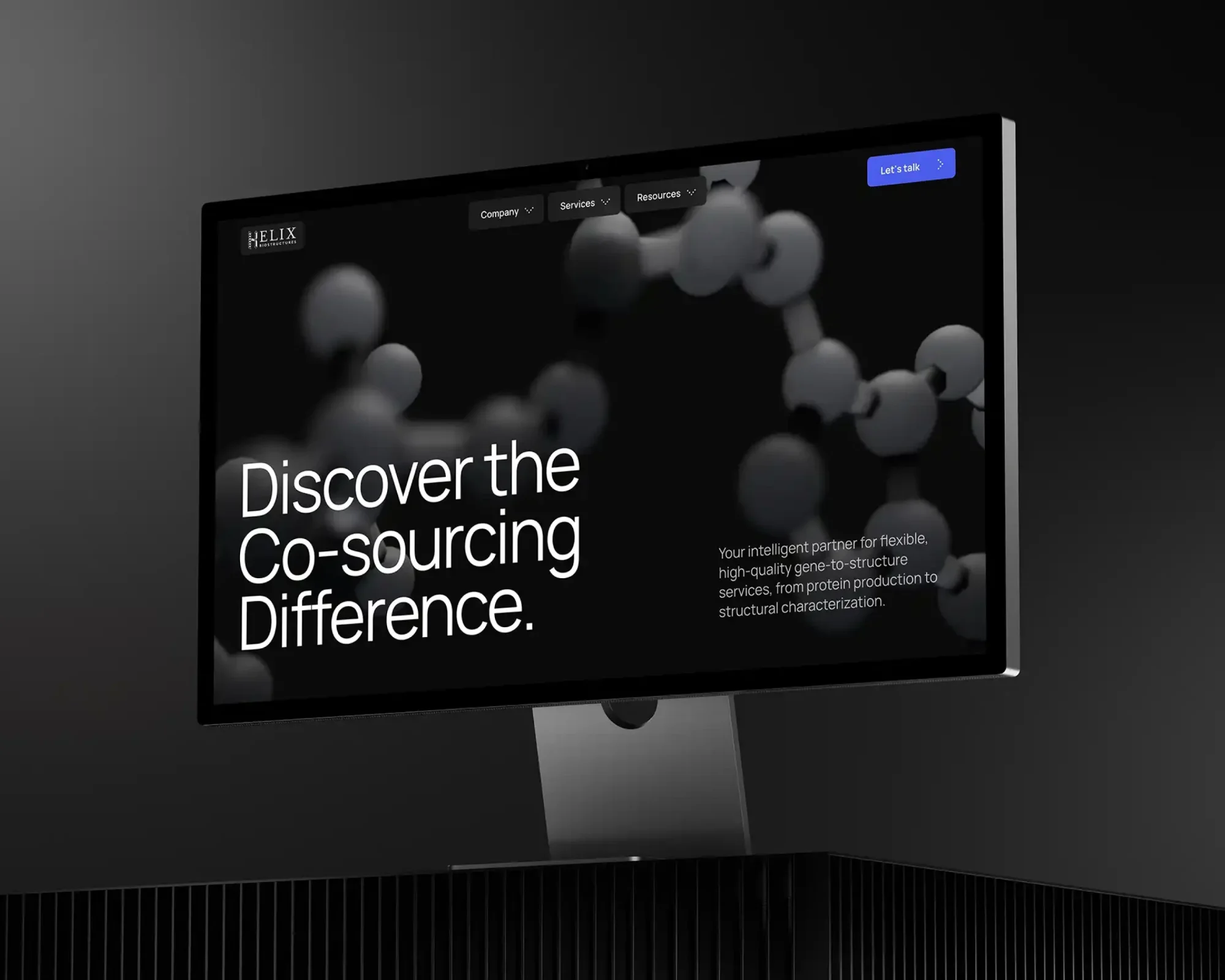

We have all seen them. The "Dribbble-ready" websites.
They feature stunning photography. They use avant-garde typography. The scroll animations are buttery smooth. They win design awards and get featured in galleries.
But they often have terrible conversion rates.
Why? Because everything on the page is screaming at the same volume.
When everything is important, nothing is.
The frustration usually sounds like this: "The site looks incredible. The brand feels premium. But nobody is clicking the button."
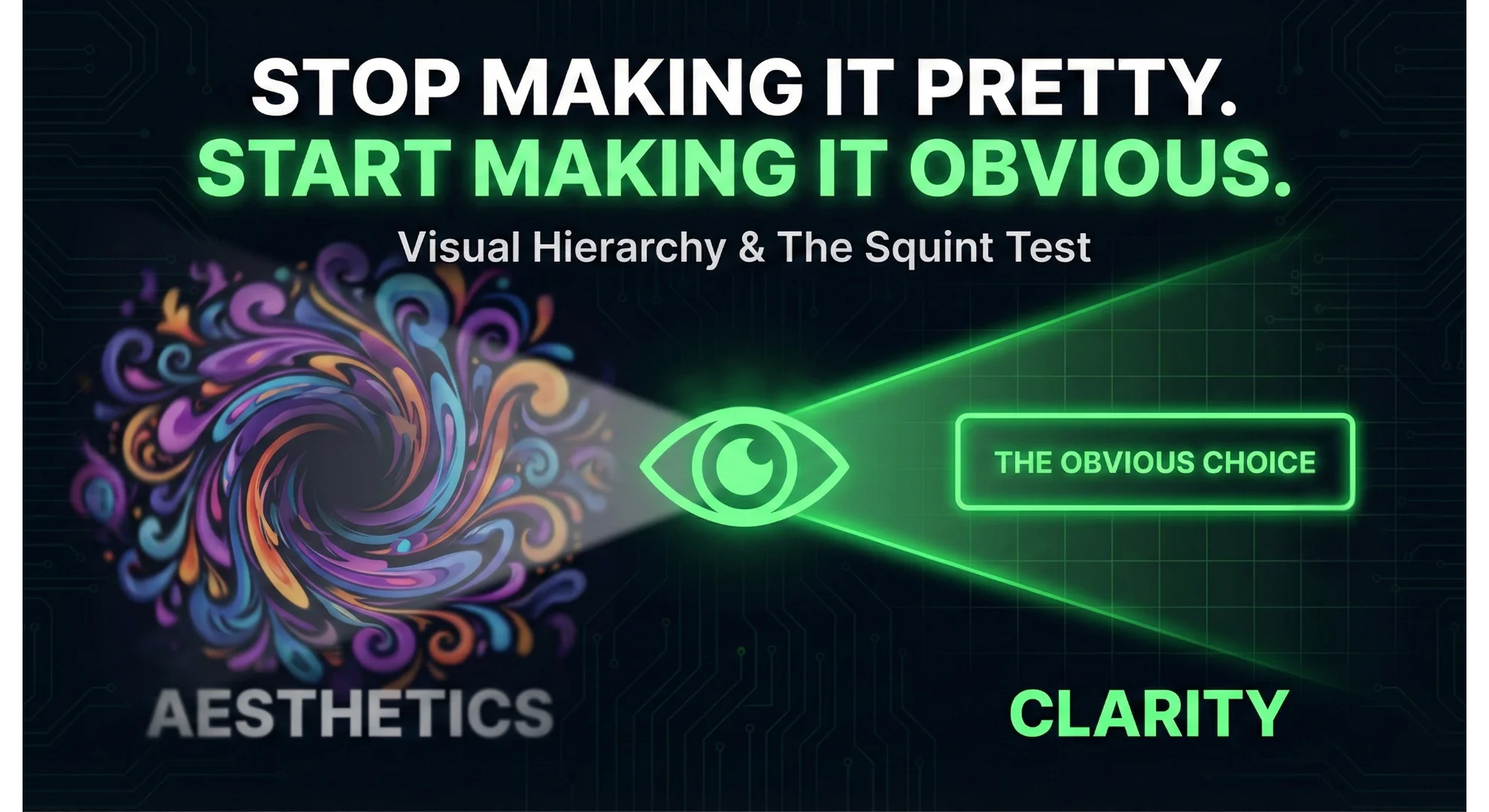
That is because your design team optimized for Aesthetics. They should have optimized for Hierarchy.
The Pretty Trap
Designers love to make things beautiful. It is in their DNA. They want balanced layouts, subtle grays, and artistic negative space.
But users are not visiting your website to admire the composition. They are visiting to solve a problem.
They are in a rush. They are scanning. They are looking for a signal in the noise.
If your "Contact Us" button is a tasteful ghost button that blends into the background image, you have chosen beauty over clarity. You have made it pretty, but you have failed to make it obvious.
Design is Not Decoration. It is Direction.
Effective web design is not about making things look good. It is about telling the eye where to look.
We call this Visual Hierarchy.
Hierarchy is the tool we use to rank the information on a page by importance. It uses size, color, contrast, and position to guide the user’s eye through a specific narrative.
- Priority 1: The Value Proposition (What do you do?)
- Priority 2: The Call to Action (What should I do next?)
- Priority 3: The Social Proof (Why should I trust you?)
If your decorative background shape is visually "louder" than your primary headline, the hierarchy is broken. The user gets distracted. The narrative snaps.
The Squint Test
So how do you know if your beautiful website is actually functional? You do not need a focus group. You just need to step back.
We use a simple heuristic called The Squint Test.
- Open your website on a monitor.
- Step back three feet.
- Squint your eyes until the text blurs and the details disappear.
Now, ask yourself one question. What is the one thing that pops out?
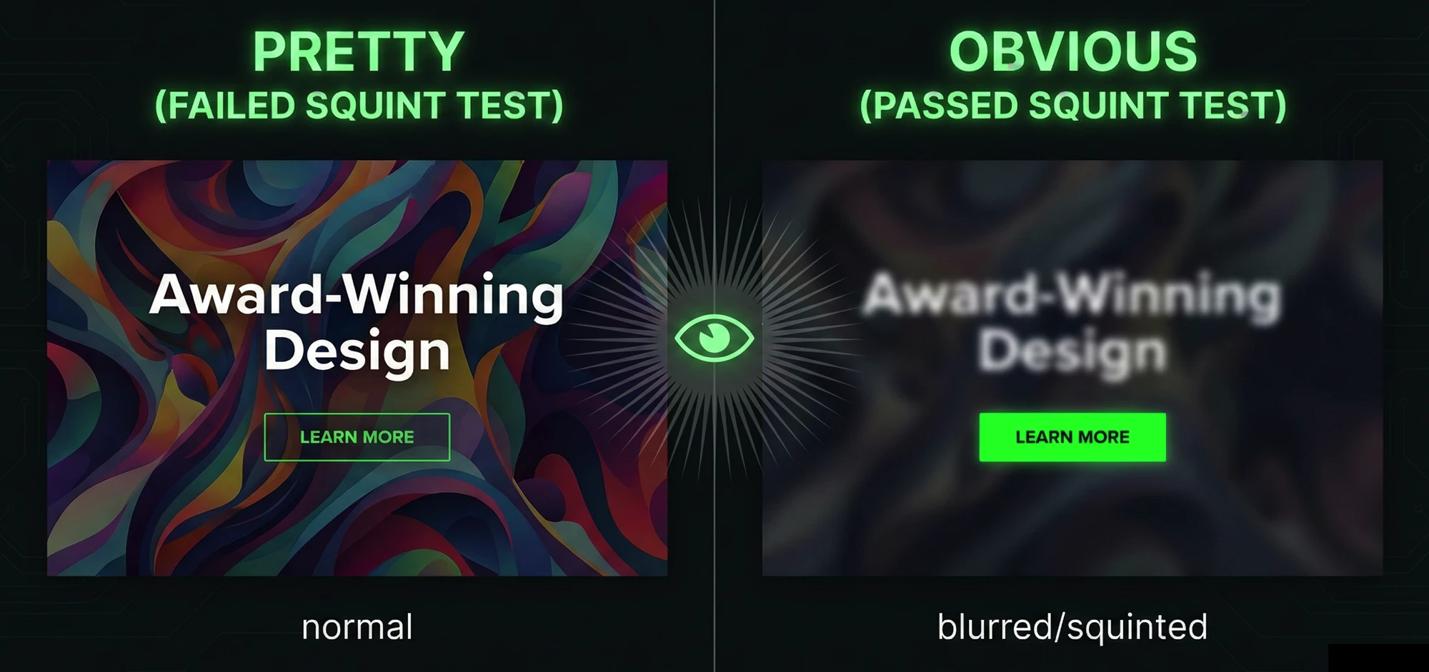
In a winning design, the "blurriest" version of the page should still highlight the Call to Action. The button should be a beacon. The headline should be a distinct block of weight.
In a failing design, the button disappears. The headline blends into the hero image. The only thing you see is a giant, decorative swoosh or a stock photo of a laptop.
If you have to search for the button with your eyes open, your user has already left.
Friction is the Enemy
Every millisecond a user spends figuring out "where do I click?" is friction.
Friction kills conversion.
You can have the best SEO strategy in the world. You can write the most compelling ad copy. But if the user lands on a page where the "Next Step" is camouflaged by "Good Design," you have wasted your money.
How to Fix It
The solution is rarely "make it pop." The solution is usually subtraction and contrast.
- Increase Contrast: If your brand colors are soft pastels, your primary button needs to be dark and heavy. It needs to look like a tool, not a decoration.
- Increase Whitespace: Do not just make the button bigger. Clear the space around it. Isolation creates emphasis.
- Kill the Decoration: If a visual element does not support the message, delete it. If it competes with the headline, tone it down.
Conclusion
There is a place for beauty. A premium brand needs to look professional to build trust.
But beauty without hierarchy is just vanity.
Your website has a job to do. It needs to answer a question and direct an action. Before you approve the next design mockup, stop asking "Do I like how this looks?"
Start asking "Do I know where to look?"
Make it obvious. The pretty can come later.