

Updating a website often starts with a simple request: add a customer quote, include a product highlight, or place a useful call to action within a page.
Changing the words may be straightforward but adding a designed section can involve more work. Someone needs to decide how it looks, make sure it works on different screen sizes, and keep it consistent with the rest of the website.
For content teams, that can mean waiting for design support before publishing. For designers, it can mean repeatedly building similar sections or checking that small updates haven’t introduced inconsistent layouts.
Reusable components help address that challenge. Webflow’s recent update brings them directly into CMS content, giving teams another way to include designed sections within the pages they manage.
I tested the feature to see how it works in practice, what someone editing content can change, and what happens when those changes are published.
What is a component?
A component is a reusable section of a website.
It might be a testimonial, a contact form, or a call to action.

Rather than rebuilding that section every time, a designer creates a main version that can be used in multiple places. Each copy follows the shared design.
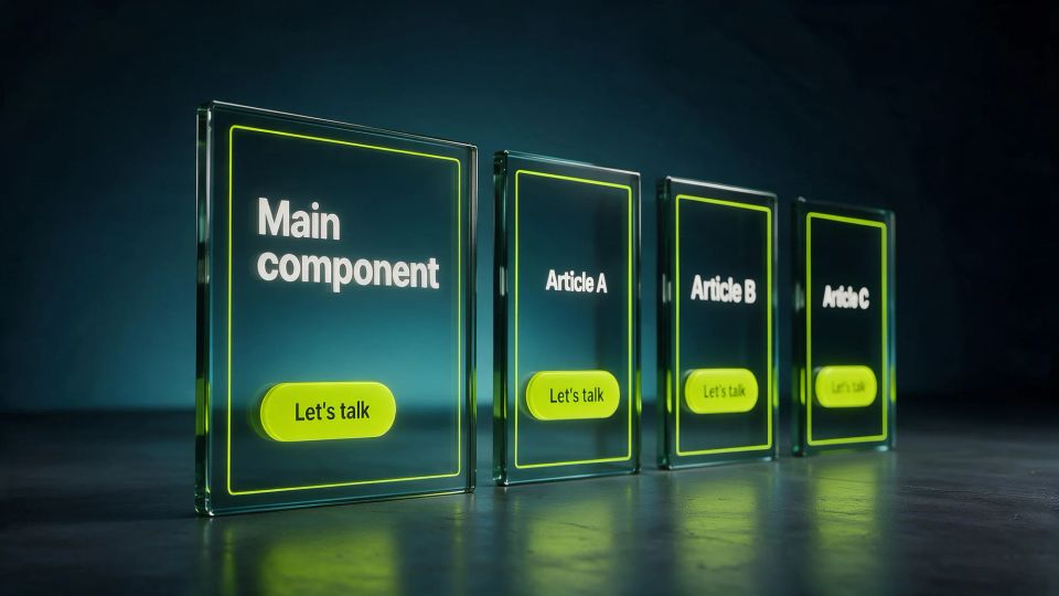
The designer can also choose which parts people can change. For example, a testimonial could have editable quote and author fields while keeping its fonts, colors and layout consistent.
Think of it as a prepared building block. The design is already in place, and the editor fills in the relevant content.
What has Webflow changed?
On September 2, 2026, Webflow announced that reusable components could be added directly into Rich Text, both on the design canvas and inside CMS fields. Each inserted component can have its own content settings while sharing the main component’s design.
The CMS, or content management system, is where a team manages content such as articles, case studies and other recurring pages. A Rich Text field holds the main body of that content, including paragraphs, headings, images and other supported elements.
The update lets suitable components sit within that body of content. A case study could include a customer quote between paragraphs, for example, or a product page could include a designed information panel. The feature is available on every Webflow Platform and Site plan except Basic.
It adds flexibility within the content area. The wider page layout and the available components still need to be set up appropriately.
We highlighted this feature in our Webflow Conf 2026 takeaways. This experiment takes a closer look at how it behaves in everyday use.
Why this matters for content and design teams
Content rarely fits exactly the same structure every time. One case study might need a testimonial near the beginning; another might need a product highlight halfway through.
Without a suitable setup, those requests can create extra design work. Rebuilding similar sections individually also makes it easier for spacing, colors or layouts to drift across the website.
Components offer a way to prepare those sections in advance. Designers establish the appearance and choose the editable fields. People with the right permissions can then use those sections and tailor their content.
That setup matters. Clear field names and sensible editing permissions can make the difference between a tool that feels confusing and one someone can use comfortably.
For this experiment, I focused on one example: a reusable call to action, or CTA, inside an article.
The test at a glance
I created a CTA containing a heading, a short paragraph and a button, then tested it in two articles.
The process was:
- Add the prepared component to an article’s Rich Text field.
- Change its heading, paragraph and button link.
- Repeat in a second article to check that the content stays independent.
- Update the main component’s design and compare both articles.
- Check Content editor permissions and the published pages.
The everyday editing task was simple: open the existing CTA, update its fields, and check the result. Building the component and deciding what should be editable happened first.
Adding the CTA to Article A
Inside Article A’s CMS Rich Text field, I added a new line, opened the insert menu, selected Component, and chose Article CTA.

Choose Component from the Rich Text insert menu to add a prepared section to the article.
The CTA appeared as a labelled block in the CMS field. I could then check its visual appearance on the article page in Webflow’s Designer.
The insertion worked: the CTA became part of the article content, positioned after the opening paragraph.
I used an existing component for this step, so there was no need to build or style the section while writing the article.
Giving each article its own message
Next, I opened the inserted CTA’s properties, the fields provided for changing its content.
For Article A, I changed the heading to:
“Let’s talk about Article A”
I changed the paragraph to:
“This CTA has been customized specifically for Article A”
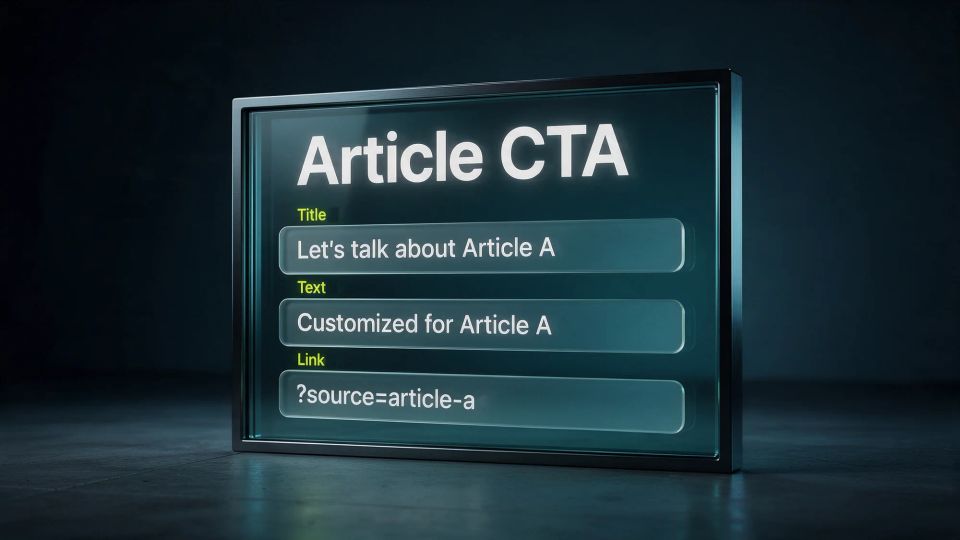
The existing CTA exposes fields for changing this article’s heading and paragraph.
The changes were saved and remained when I reopened the component.
I repeated the process in Article B with its own heading and paragraph. In that article, the CTA sat before the opening paragraph.
Both articles kept their own content and placement. Changing Article B’s message did not replace Article A’s customizations.
For an editor, this is the useful part: the section’s design is already prepared, and the task is to fill in the message for that page.
Checking the button links
Each CTA also needed its own destination. I used two example URLs so I could distinguish them:
- Article A: https://example.com/?source=article-a
- Article B: https://example.com/?source=article-b
An initial click attempt produced no visible result. Saving a link alone wasn’t enough to confirm it worked, so I checked again on the published pages.
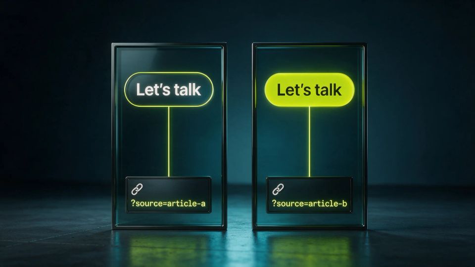
Article A’s CTA opens its own example URL, ending in source=article-a.
In the final staging test, Article A’s button opened its own URL, and Article B’s button opened its own URL.
A staging site is a published test version of the website, where changes can be checked before they reach a production domain.
Both destinations worked independently.
Changing the shared design
To test a site-wide design change across these instances, I edited the main Article CTA component and changed its background to pale blue: #E8F0FE.
The main component’s background colour is set to #E8F0FE.
The new background appeared on the CTAs in both articles and on the separate CTA in the article template.
Each article retained its own heading, paragraph, button destination and component position. The shared design changed without replacing the individual content.
This is useful when a team wants to refresh a section used in multiple places. In this test, I changed the main component once rather than editing each CTA separately.
After publishing and resolving the publishing issue described below, the pale blue design appeared on both staging pages too.
Check styling and interactions
Before handing components over to content editors, test their text colours, hover effects, animations and button links inside Rich Text on the published staging page.
Our simple CTA test confirmed that content editing and shared design updates worked. However, when reviewing more complex button components, we saw text colours that didn’t display as intended. The cause remains unconfirmed, so we can’t yet attribute this issue to components in Rich Text.
What can a Content editor change?
I switched to Content editor mode to check the experience for someone responsible for updating content.
I could open the existing CTA’s fields and change its heading. However, the Rich Text insert menu did not offer a Component option.
Site managers, Designers and Marketers can add, move, copy and delete components inside Rich Text, as well as edit their properties.
Content editors can only edit the properties of existing components, such as the heading, paragraph or button link. They cannot insert or rearrange the components themselves.
For your team, this means choosing permissions to suit each person’s responsibilities. Someone managing article copy can update the available fields, while someone with a suitable role can add or reposition the designed sections.
Moving or removing a component
If you have a Site manager, Designer or Marketer role, you can reposition a component within the CMS Rich Text field using cut and paste:
- Click the component to select it.
- Press Cmd+X on Mac or Ctrl+X on Windows.
- Place your cursor on a new line where you want the component.
- Press Cmd+V on Mac or Ctrl+V on Windows.
The component keeps its customized property values when moved.
To remove a component, click to select it and press Delete or Backspace.
Getting your changes ready to publish
Once you’ve updated the component’s content, publishing makes those changes available to visitors.
There are two parts to check:
- Article content: if the article is a draft, choose Queue for the next site publish before publishing the site.
- Shared component design: if you’ve changed the main component’s appearance, complete a full-site publish. Publishing an individual article uses the component design from the most recent full-site publish.

Select the Webflow staging domain to publish the test site.
If the component is brand new, include it in a full-site publish first. Otherwise, it won’t appear on the published page when you publish an individual article.
After publishing, open the staging page and check the component’s text, appearance and button destination.
Article A on staging, with its customised CTA and the shared pale blue design.
For someone managing content, these steps can form a short, repeatable publishing routine. At Scaler, we can prepare the components, give their editable fields clear names, and establish the workflow so your team knows what to update and how to check it.
During this experiment, I encountered a recurring 404 despite the articles showing as published. Republishing the individual CMS items restored the pages. The cause remains unconfirmed, but the final staging checks verified both CTAs’ content, design and links.
Where the right setup makes a difference
The feature’s value starts with preparing useful components for the people who will manage the website.
That means deciding which sections the team needs, designing them for different screen sizes, choosing what editors can change, and giving those fields clear names. It also means establishing who can insert components and how publishing should be checked.
That preparation is where we come in at Scaler. We can build the reusable sections and shape the editing workflow around the team’s needs, so routine content updates involve choosing or updating prepared elements.
Our experiment using Webflow CMS to generate blog feature images explores a related aim: giving individual articles their own content while maintaining a consistent visual direction across the wider blog.
For this CTA test, everyday customization was straightforward once the component was set up. The editor had a heading, a paragraph and a link to update, while the shared design stayed consistent.
Webflow’s CMS components offer a useful way to make content more flexible. This experiment showed that the content and design behavior worked, while the recurring publishing issue remains a finding to investigate.